The Laundry Room Reveal
Our big renovation wrapped about a month ago and it’s about time that I start to share some of the spaces now that we are settling in to our home. The space that feels the most finished (even though it isn’t quite finished) is our laundry/mudroom and that’s where I’d like to focus today. Before beginning the photo tour, I want to just reiterate that these spaces, although completed in terms of the renovation, are not necessarily in their final form. In fact, I don’t think your home is ever really completed because it’s meant to change and adapt with your family as you change and adapt. We have really just started digging into our moving boxes and are trying to find homes for things, so it’s very possible that this space will evolve as we continue to both unpack our belongings and actually use it. But for now, let’s dive in to this mostly finished space!
The Before Photos
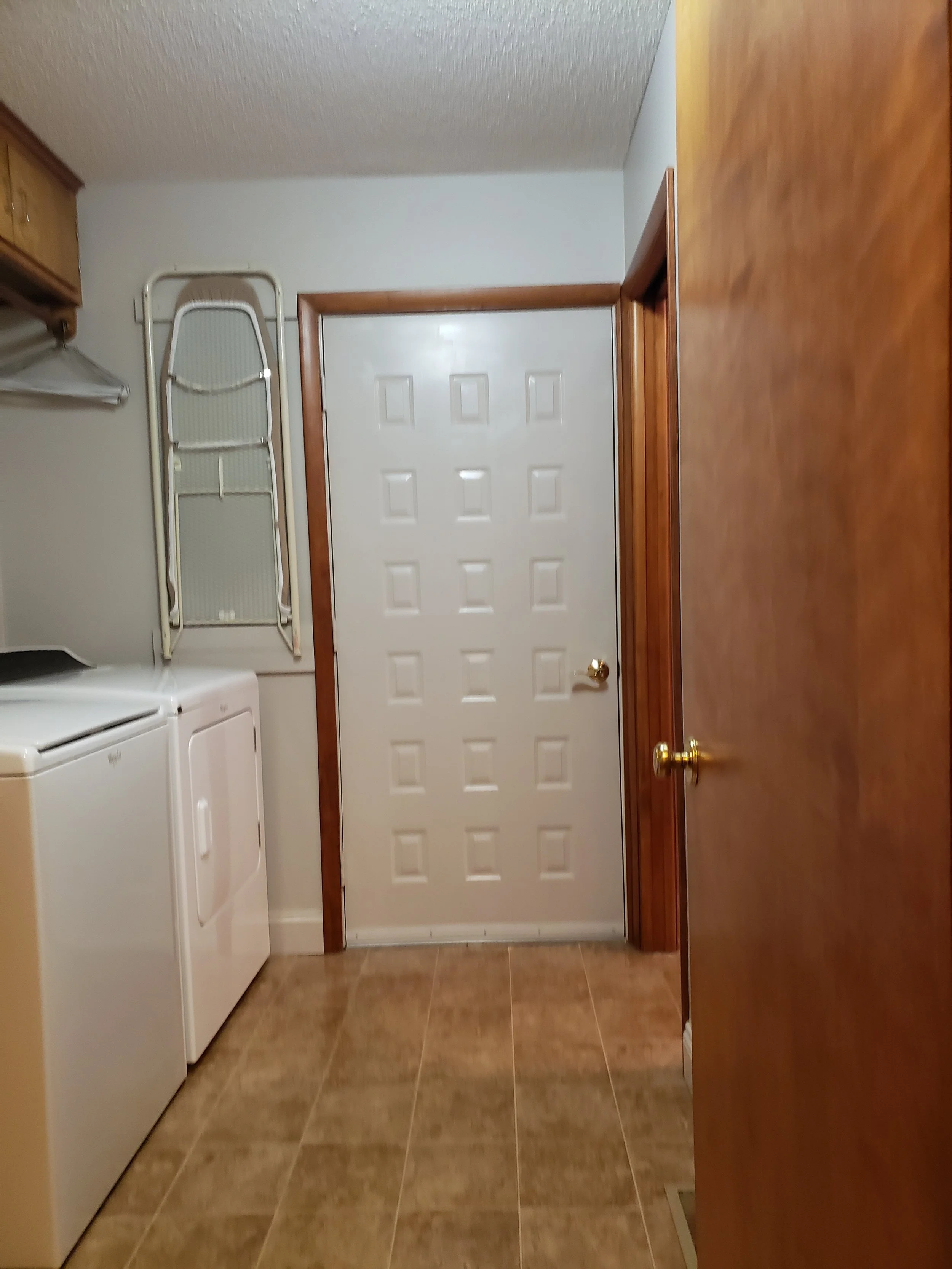
Before - looking towards the garage
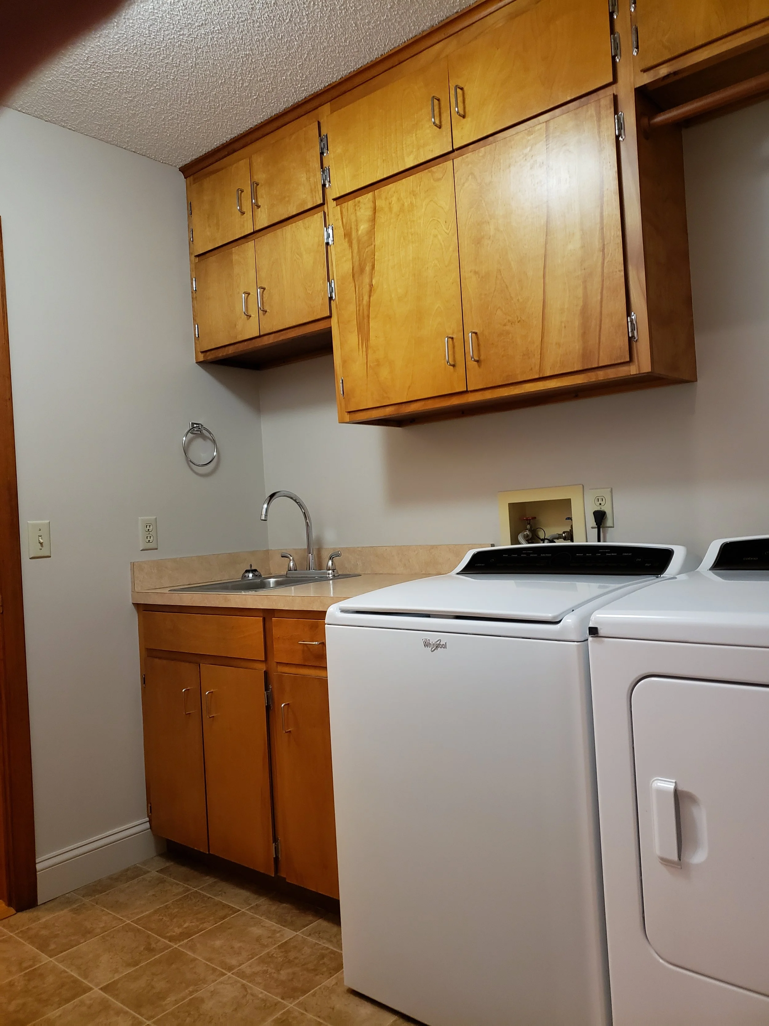
Before - looking from the kitchen
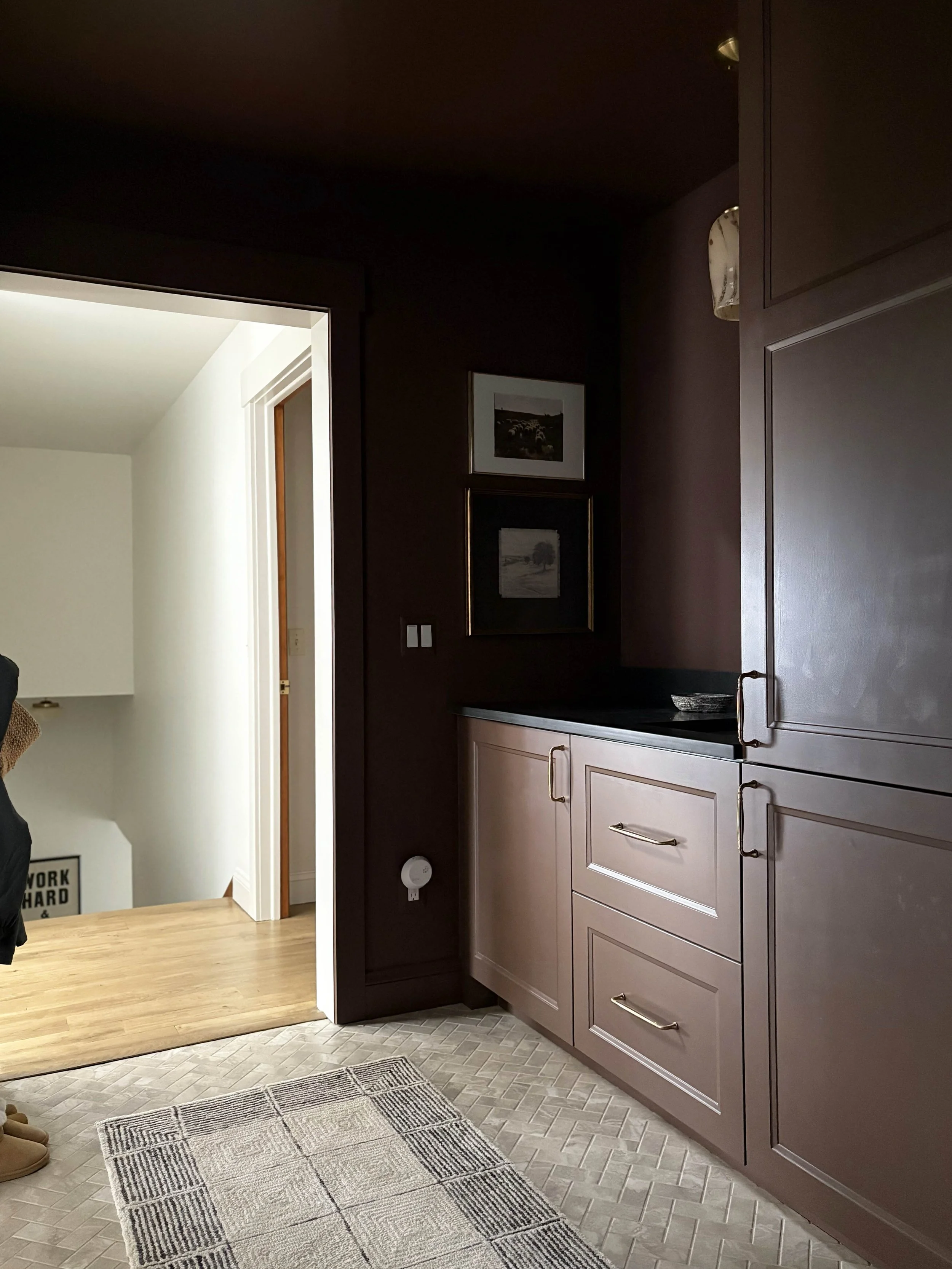
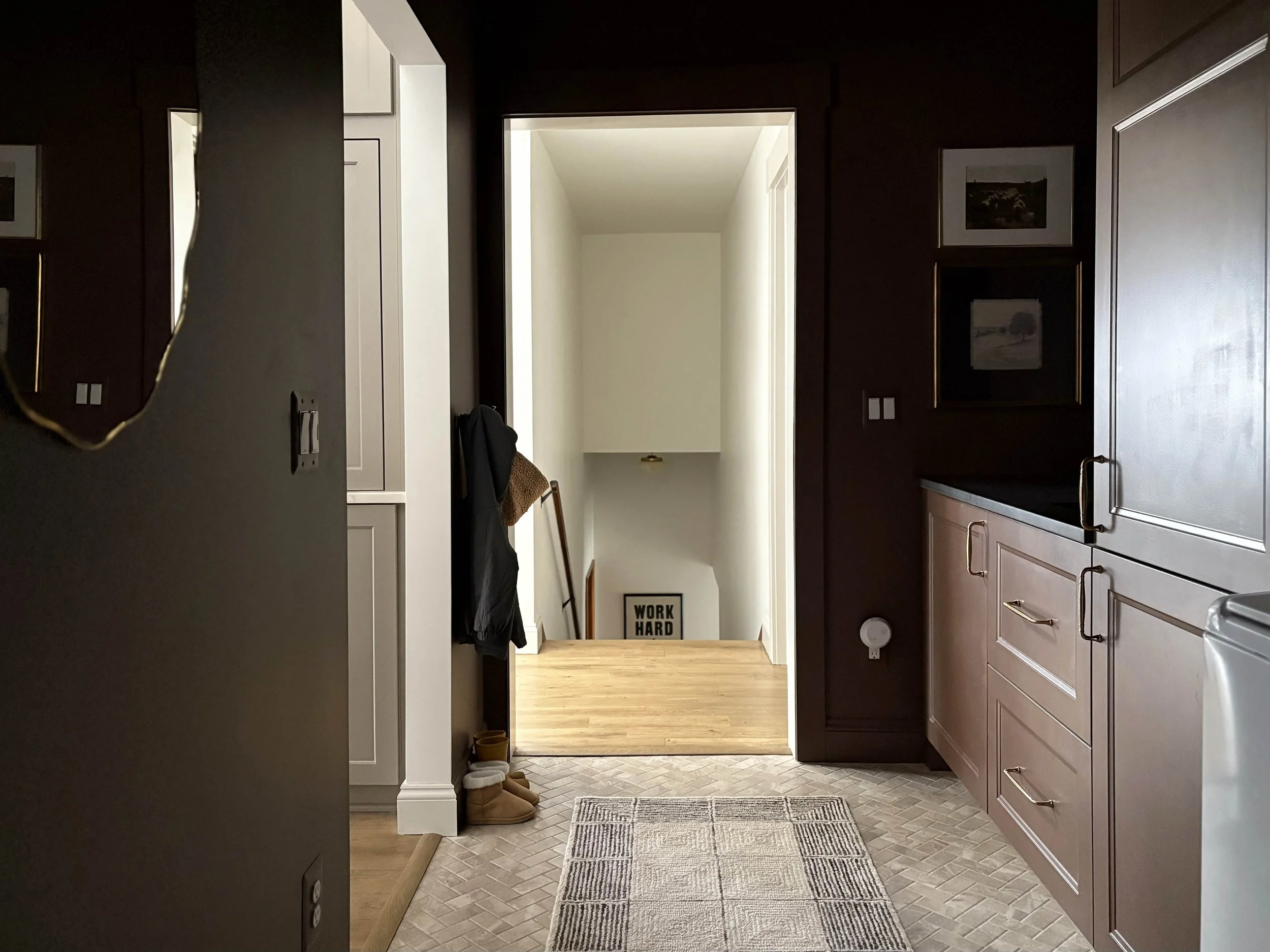
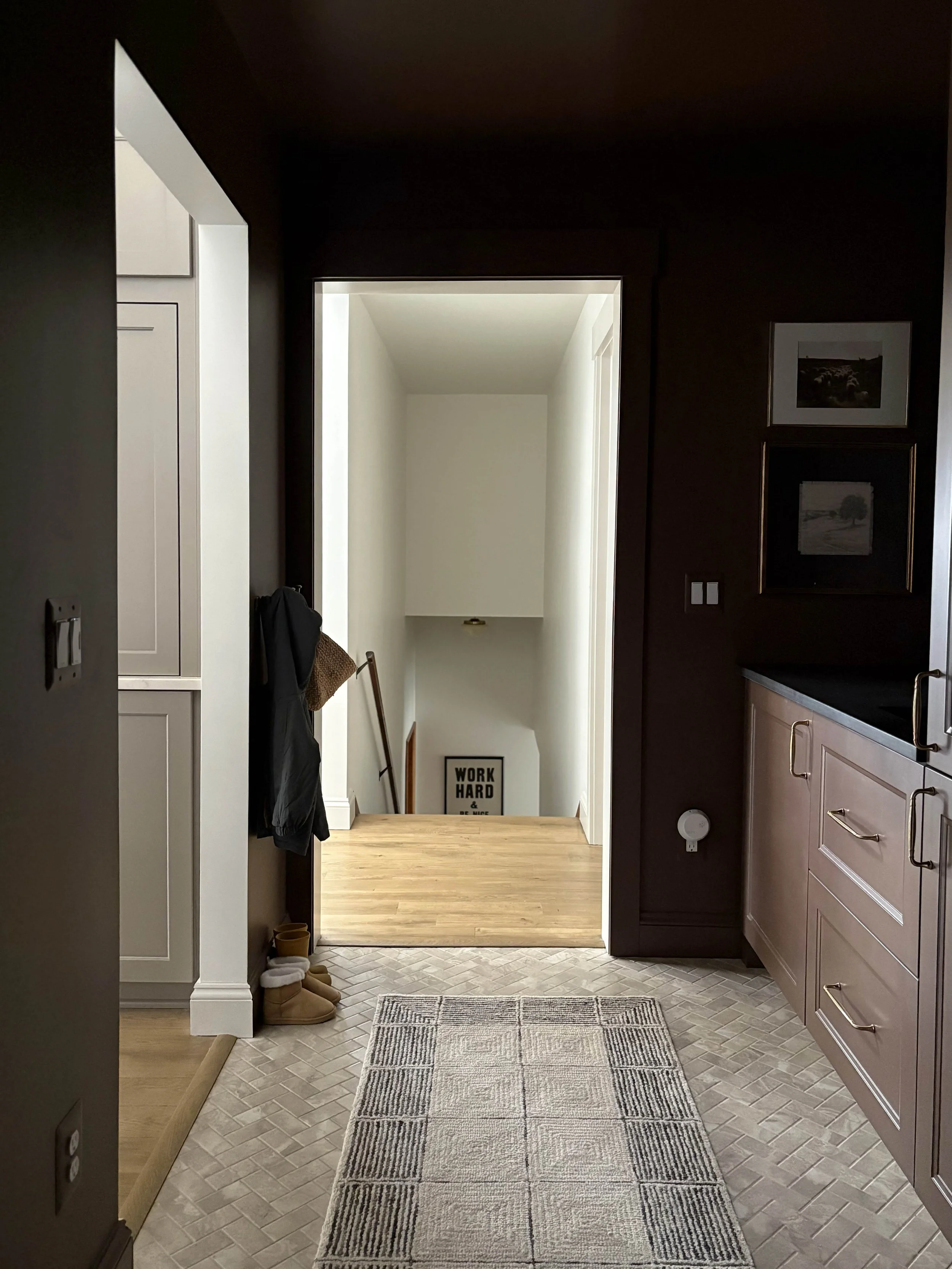
I don’t have much to show for the before because this is a very tiny space and there were only so many angles you could squeeze a photo in from. Our laundry room is the room you walk into from the garage and has doors into both the kitchen and the living room. It’s a central area of the home, which made it a top priority in our renovation. With two kids, it needed to function as more of a mudroom and laundry room space with adequate storage. We ended up removing a closet right outside of this room and absorbed that space into the laundry room to give us a little bit more square footage and also adjusted the location of the doorway into the kitchen to accommodate our new kitchen layout. Other than those two changes, we maintained the main layout of the room, opting to keep our existing laundry machines (and their locations) and only slightly shifted the location of the sink plumbing to center it on the door into the kitchen.
The Plan
I’m only going to touch briefly on the plan here because I previously published a more thorough post about the plans for this room (you can read that here). Once I knew the new dimensions of the space, we decided that we were going to use IKEA kitchen cabinetry to customize the built-in cabinetry to fit our needs. I uploaded our measurements into the IKEA Kitchen Planner and started to play with different options to maximize the space while still achieving the look I was after. It took some time, but eventually we settled on a plan that we felt struck the right balance between functional and beautiful. I knew I wanted to do some customizing within the cabinets to really maximize what we could do in here, but this tool definitely gave us a great starting point.
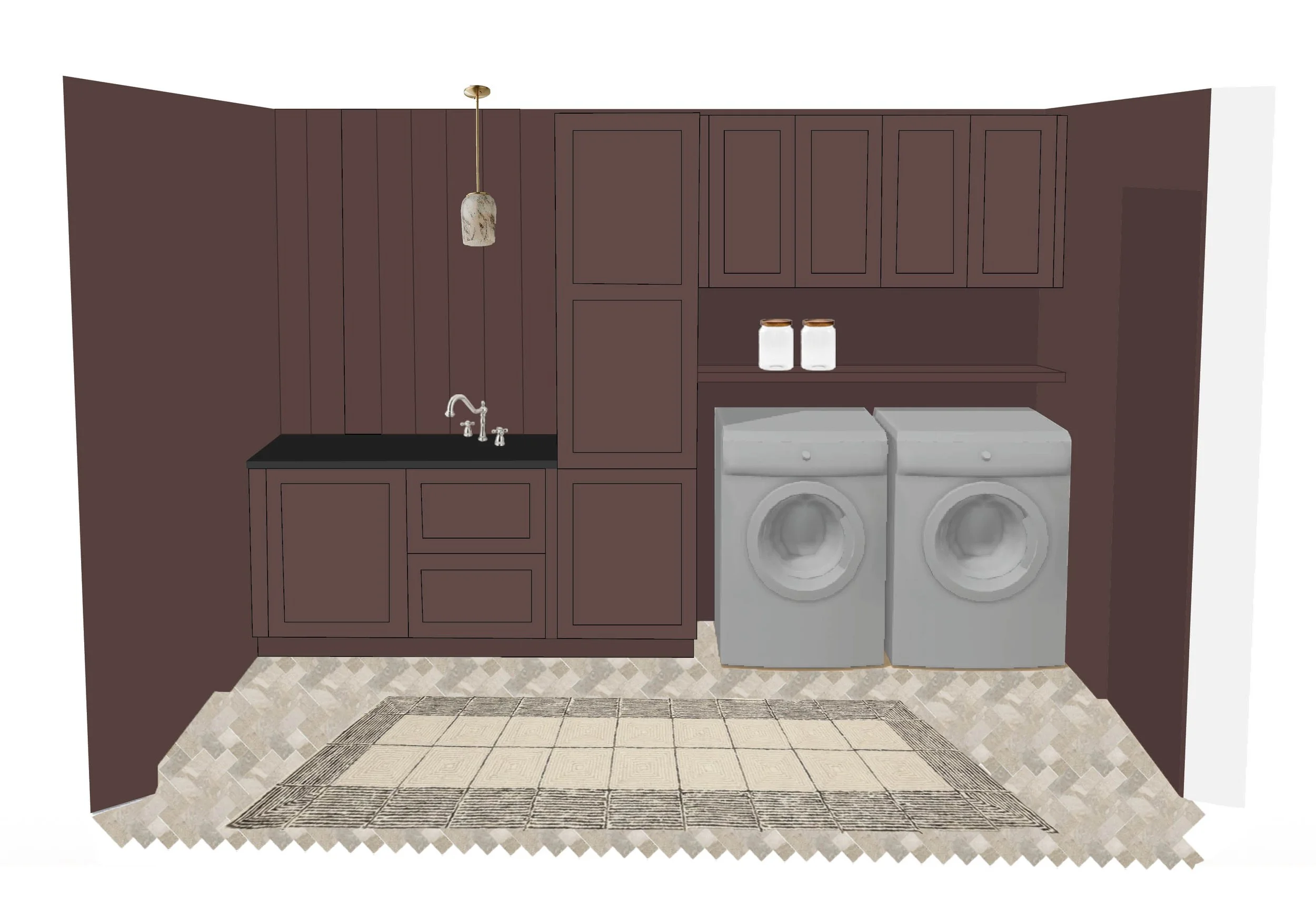
I drew on top of the IKEA Kitchen Planner (a screenshot) to get a sense of how it would translate with my design choices
When I was playing with different layout options, I specifically labelled where I would store particular items so I could make sure that I was really maximizing the storage. It helped me to narrow in on what pieces of cabinetry would actually be useful to us. I knew I wanted a full height cabinet to use for coat and shoe storage, but noting some of the dimensions helped me to narrow in on what size was most realistic. If you’d like to see more about how I planned this space and brought it to this current iteration, be sure to check out our post that outlines the plans for this room.
The Reveal (and Final-ish Design)
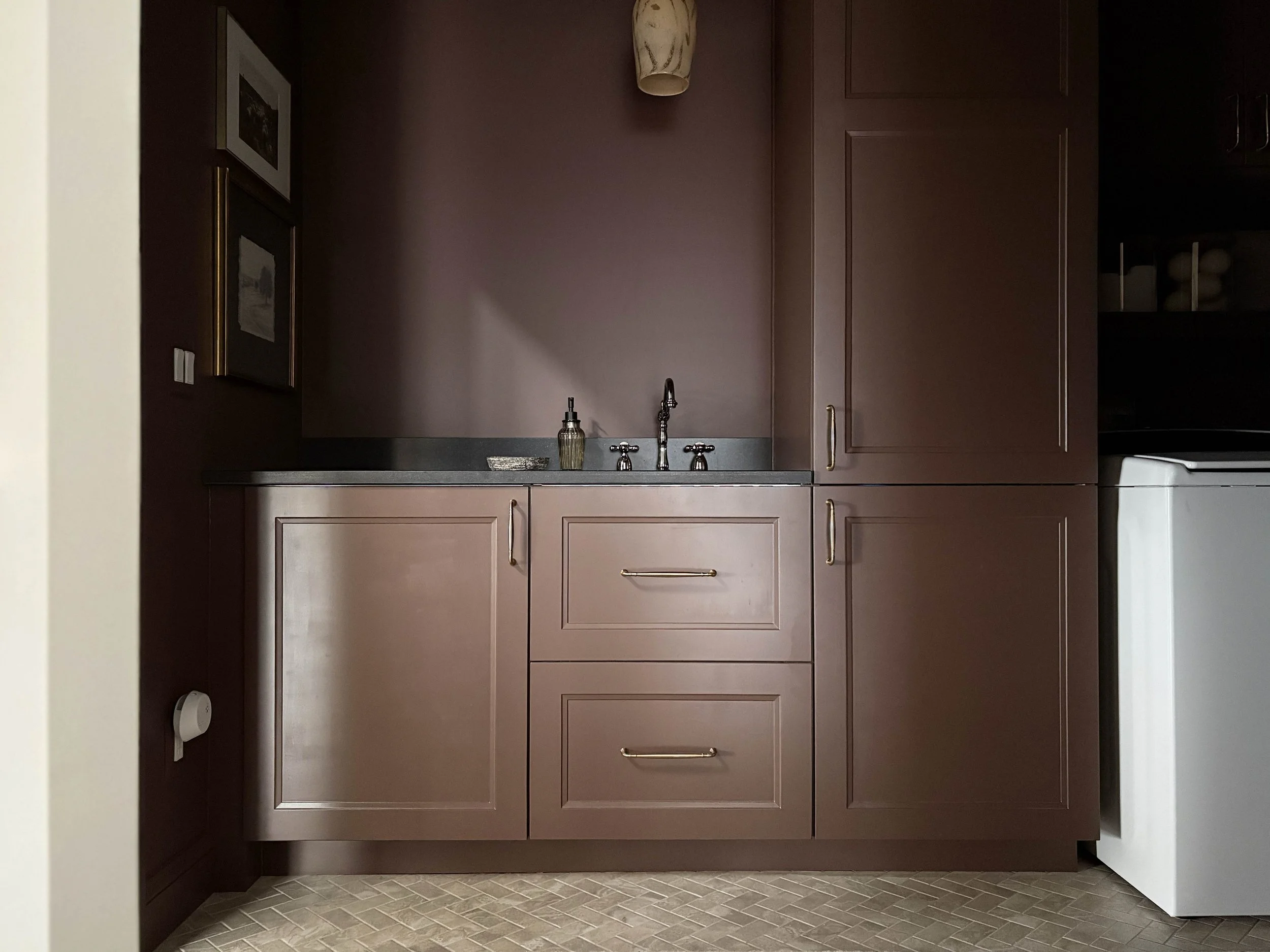
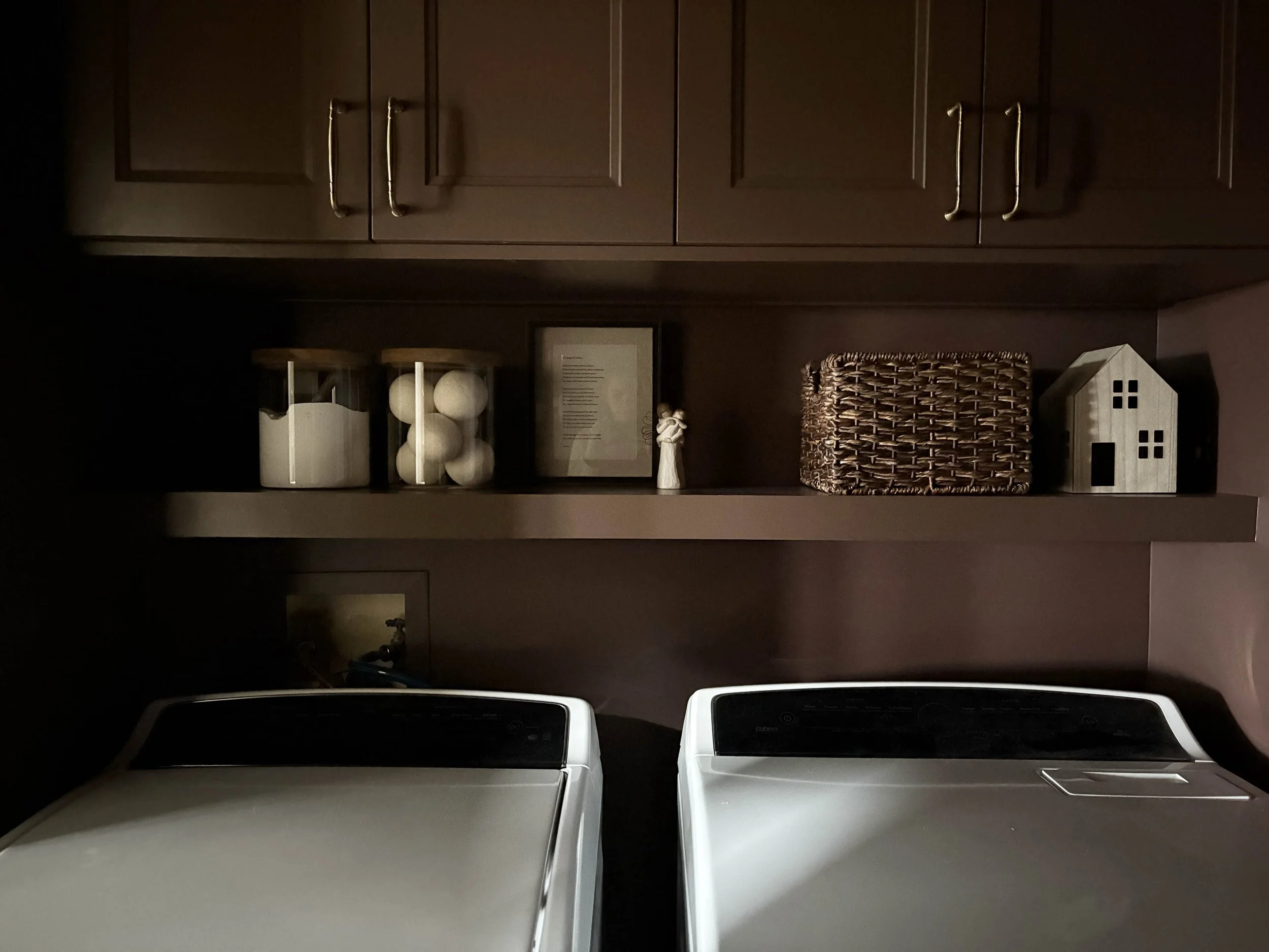
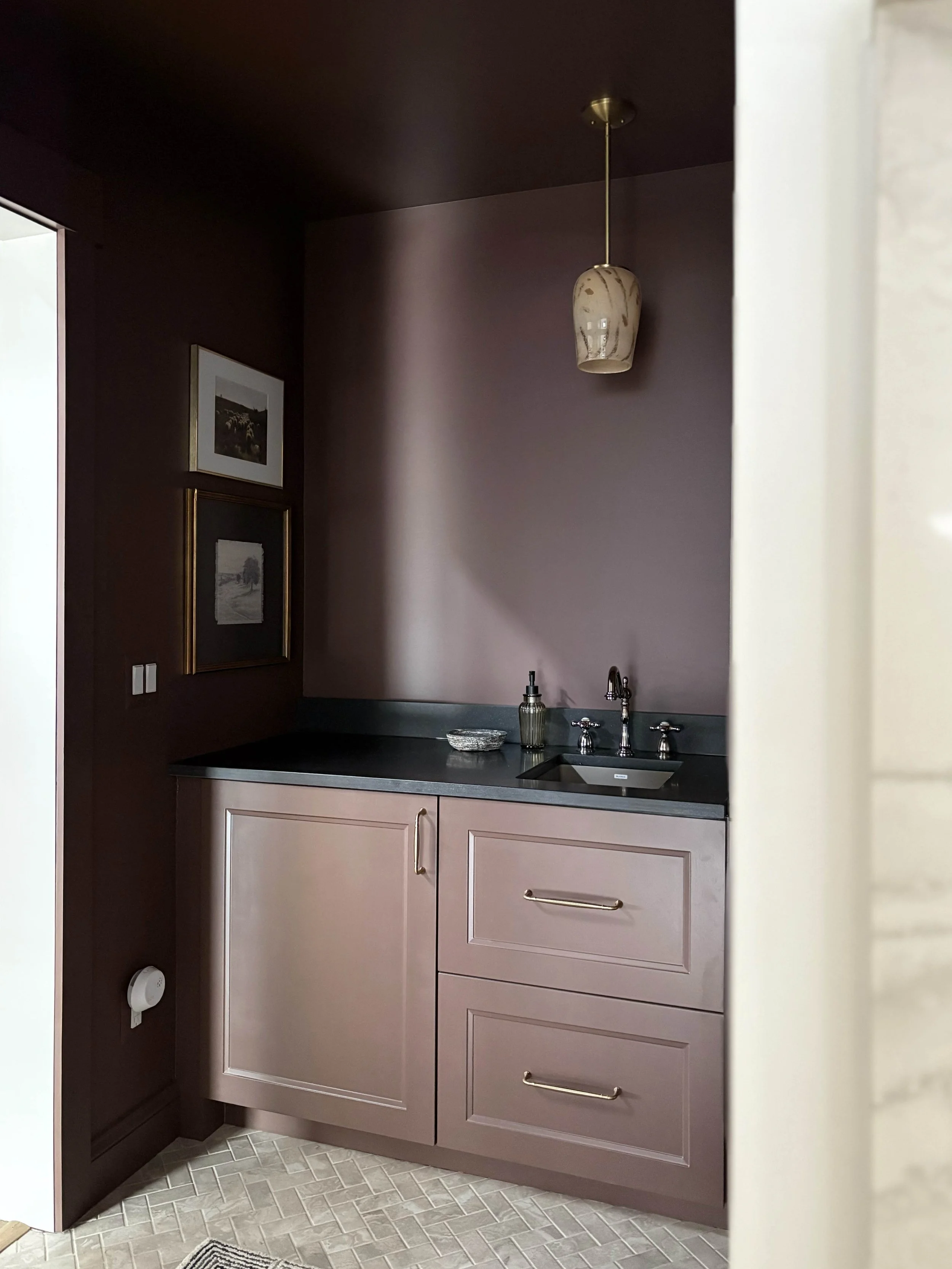
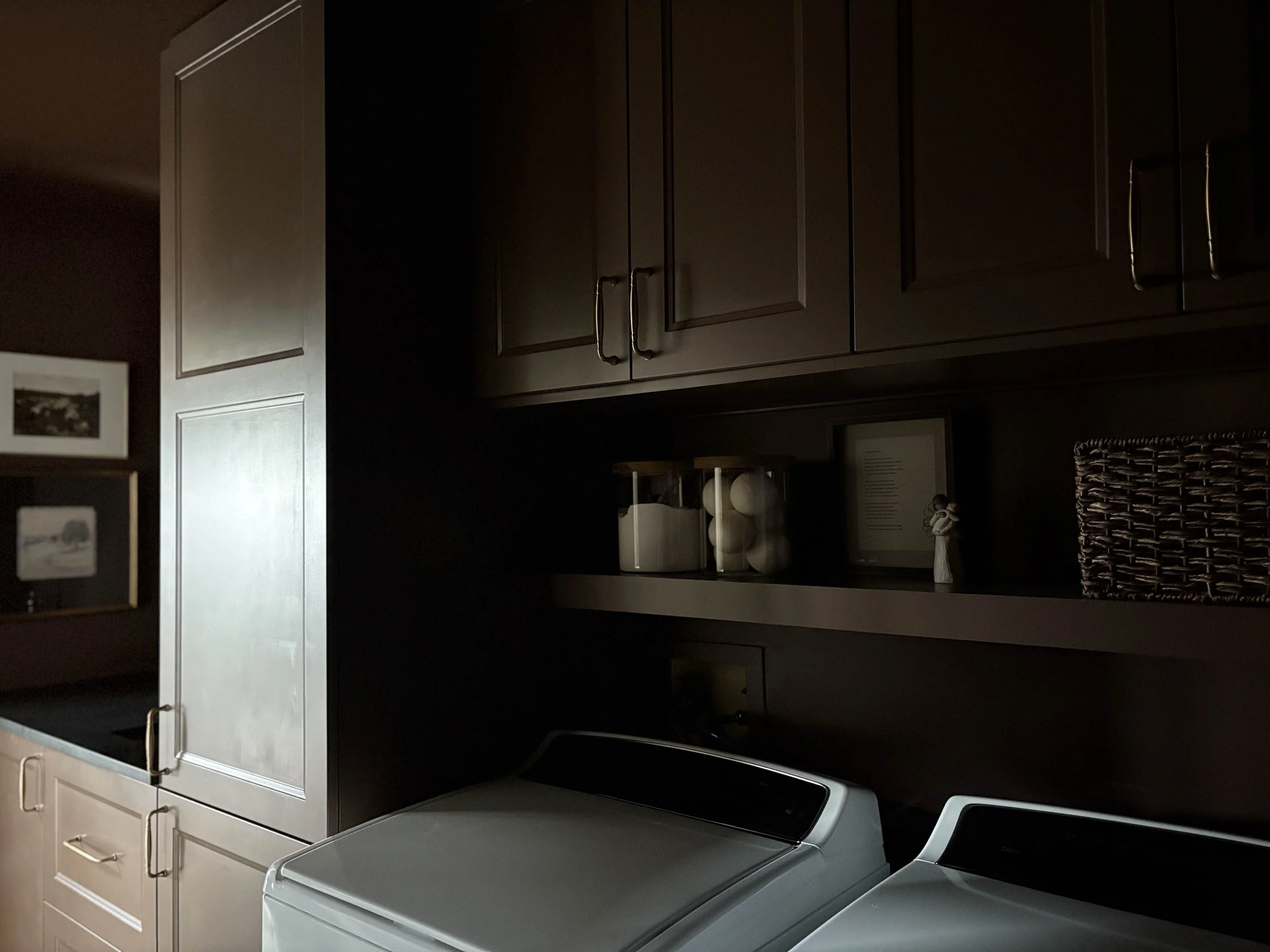
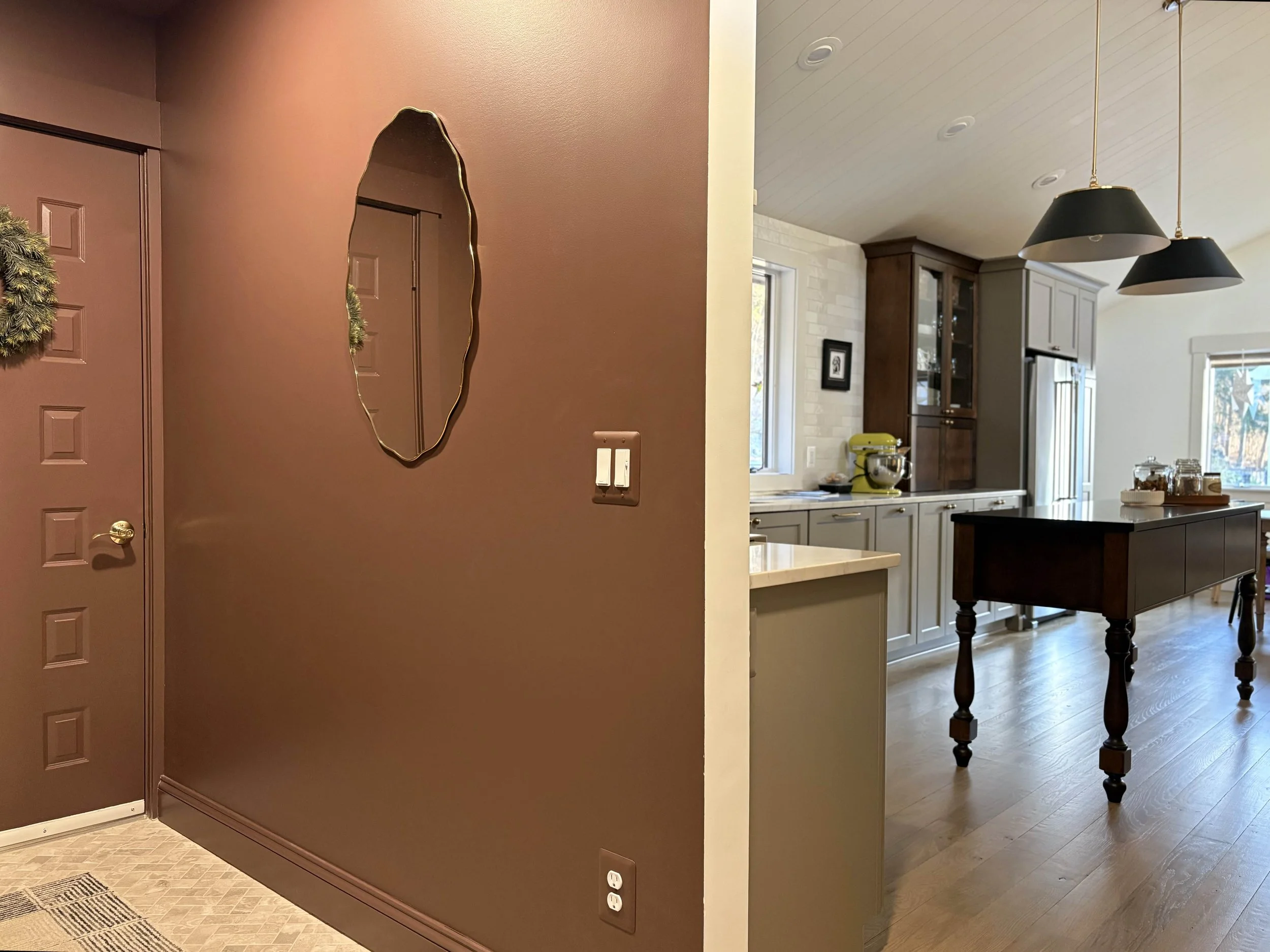
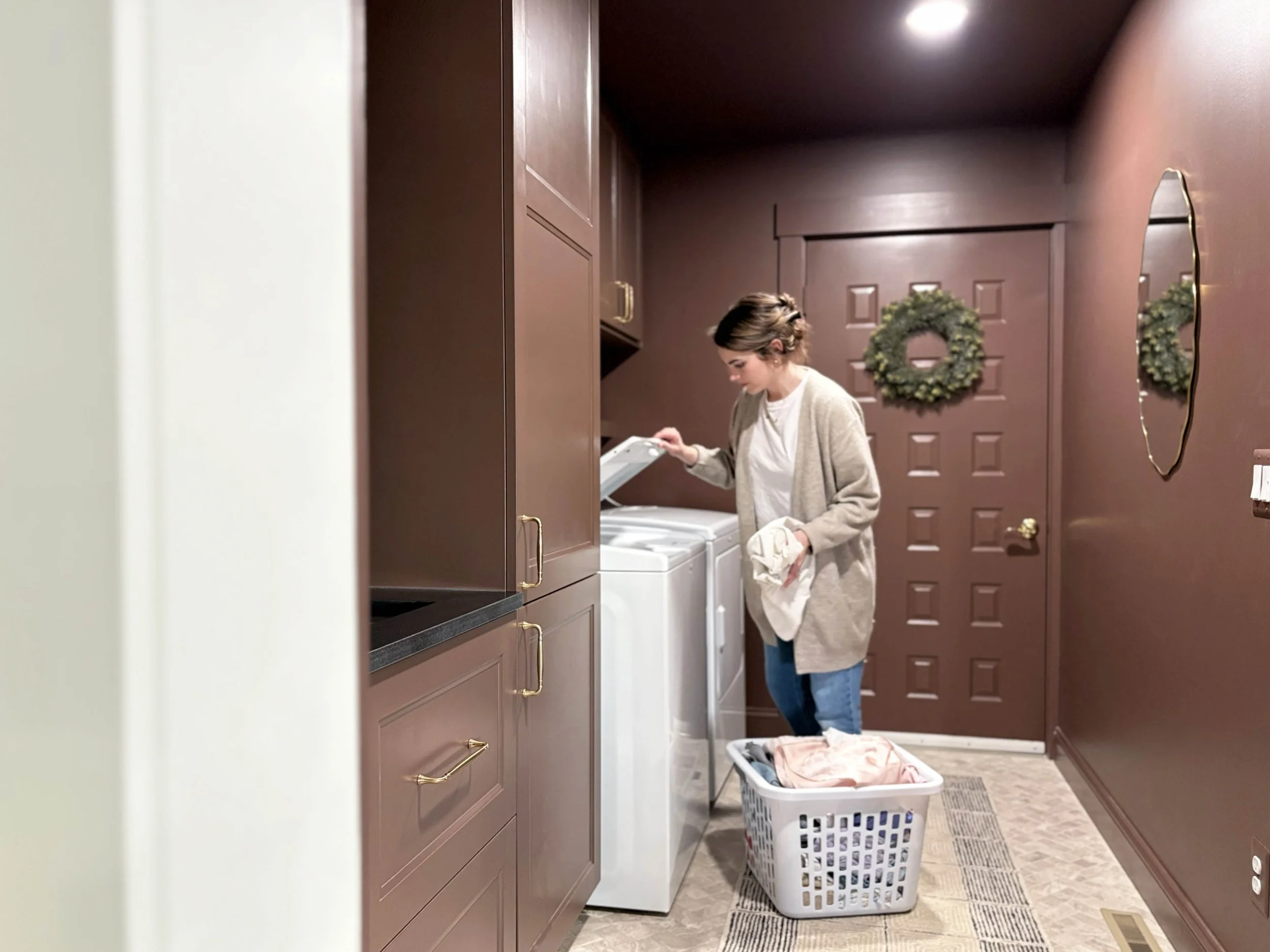
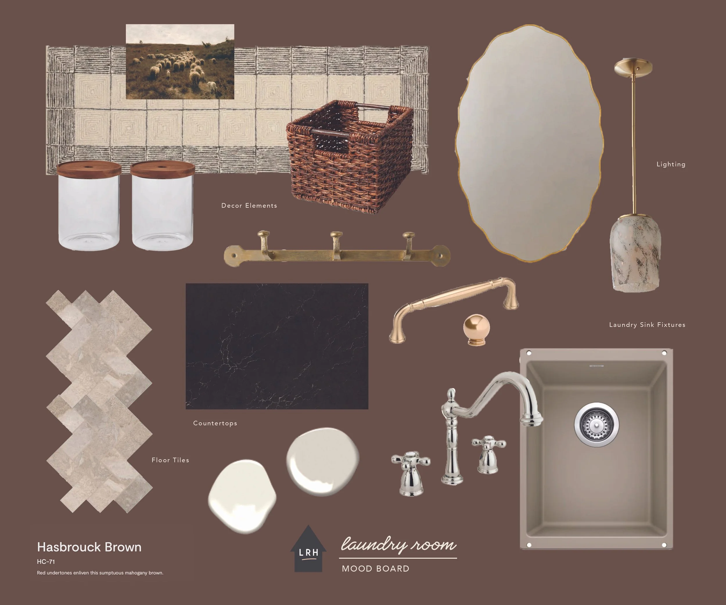
Let’s start with the color choice because that is definitely what I get the most comments on. I really wanted the design of this room to exude the strength of this little powerhouse space and so I decided to go all-in. We completely color-drenched this room - walls, ceiling, trim, cabinetry. Everything. I wanted the color to be moody and impactful, but still be neutral enough to connect with all the other tones and finishes throughout our main living space. I settled on this rich brown tone after swatching a handful of colors on the walls and feeling that this one struck the right balance of brown, red, and purple. It’s called Hasbrouck Brown by Benjamin Moore and makes you feel like you’re stepping into a hug when you walk in the door.
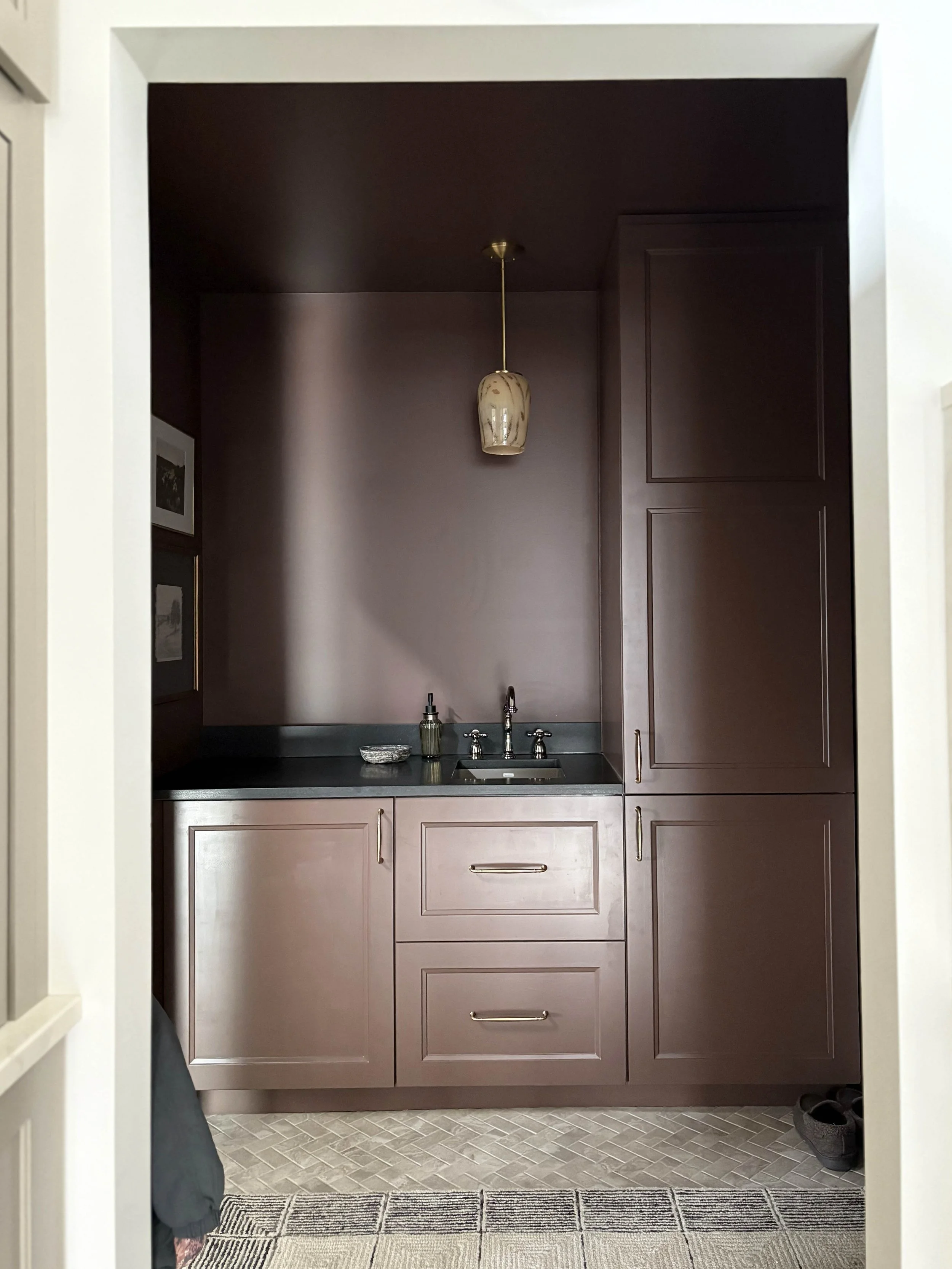
Let’s talk about the next most obvious element: the built-in cabinetry. We purchased the IKEA cabinetry used in our design plan and assembled the boxes individually before installing them into the space. We used IKEA’s installation system, but ditched the adjustable cabinet legs and instead built a platform out of 2x4’s to set the base cabinets on. This worked best for us since our floors are quite wonky and it was easier to first level the base rather than the cabinets individually. Someone on our construction team helped us install some of the filler pieces and toekick, making the cabinets feel much more built-in and custom than they would have otherwise. Before installing the doors, I primed and painted the fronts and backs in the same color as the walls specifically using a shellac-based primer and cabinet-grade paint.
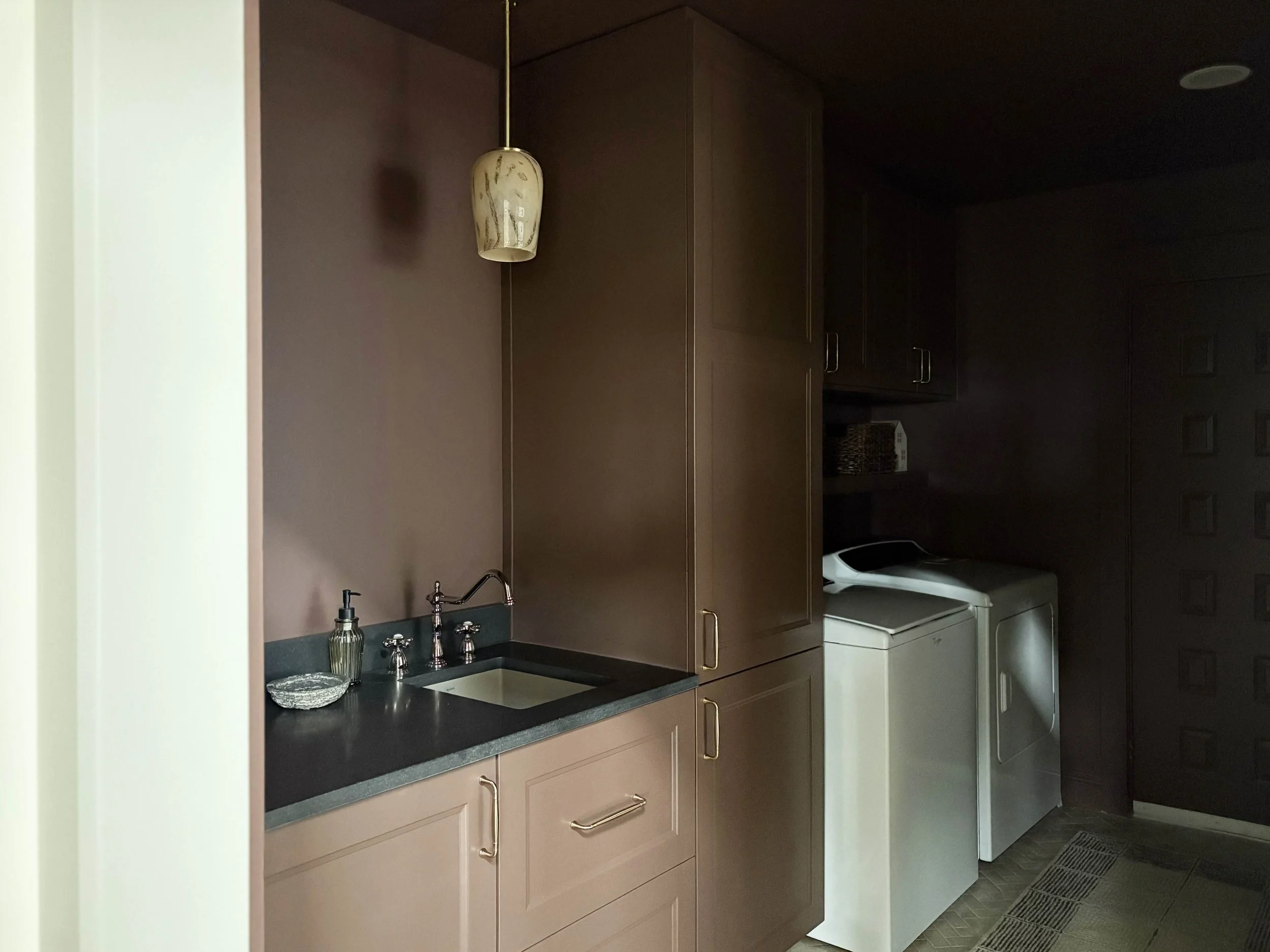
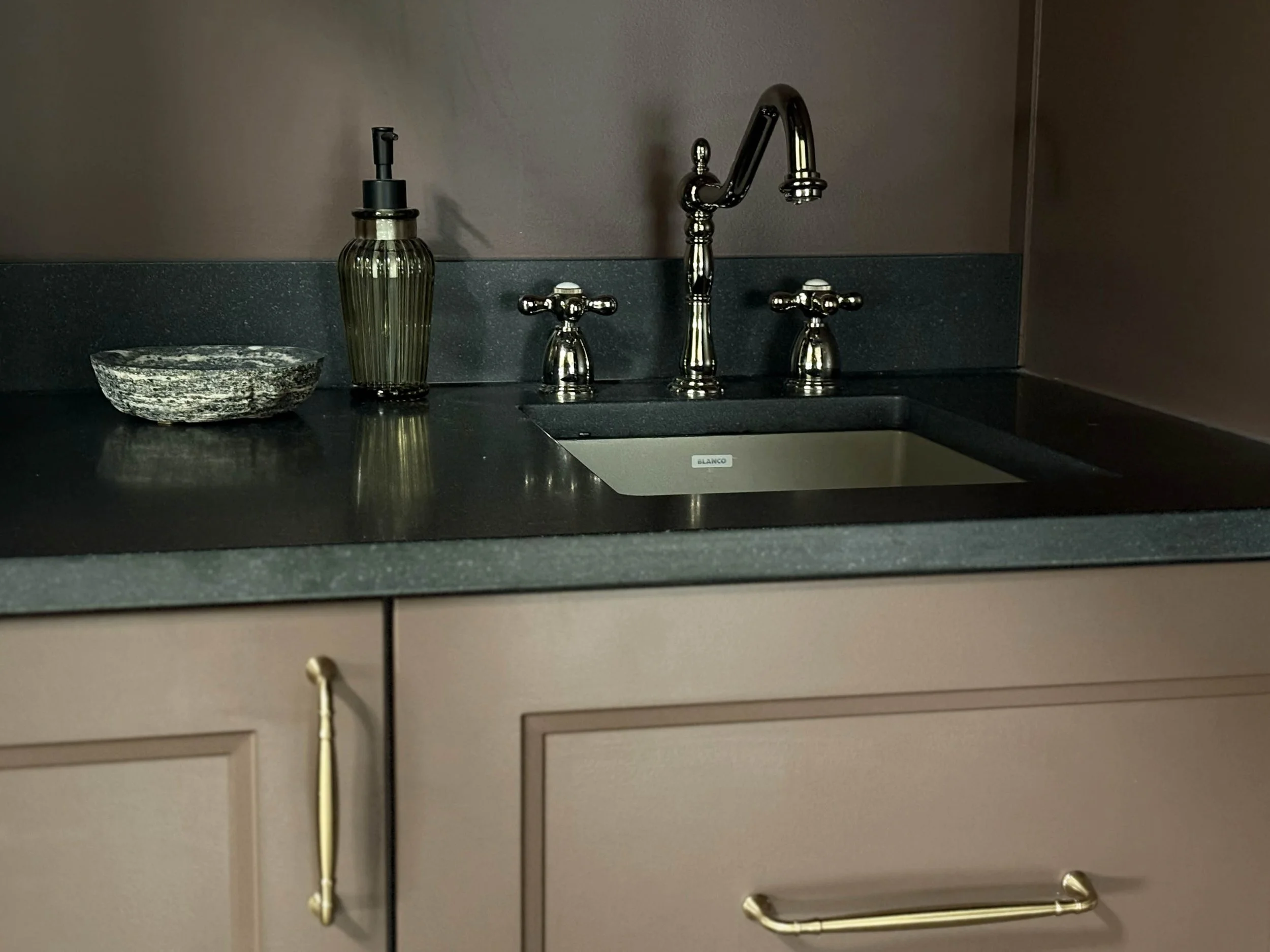
We used the same countertop as our kitchen island: a honed black granite with such a beautiful velvety finish. For the sink, I purchased a matching sink to our kitchen sink in a smaller size. It’s made of a granite composite material and has such a beautiful mushroom-toned finish. These sinks have been so easy to clean and are very durable.
Let’s next chat about hardware and finishes. Many of the design decisions made in this space were carried over from our kitchen design, as they really are connected spaces. This room is visible from the main view of our kitchen and so I wanted them to feel connected, yet play into how they are distinct. The entire process of designing this little room was working through where we could compliment the kitchen and where it made more sense to match. So let’s walk through this a little bit. We carried in the same countertop and went with the same mixed metal look for the finishes, but I tried to find complimenting pieces rather than defaulting to just matching everything. Like the kitchen, the faucet in here is in a polished nickel finish, but has a more distinct vintage bridge-faucet look with individual knobs. Stylistically, it connects with our kitchen faucet, but it is a different fixture.
For the cabinet hardware, I used the same line as our kitchen hardware. Our kitchen cabinets all have knobs except for the panel-ready dishwasher, which we used a pull on. I purchased those same pulls and used them here in the laundry room, so again, it connects but feels like a distinct space.
View from the kitchen
View from the kitchen
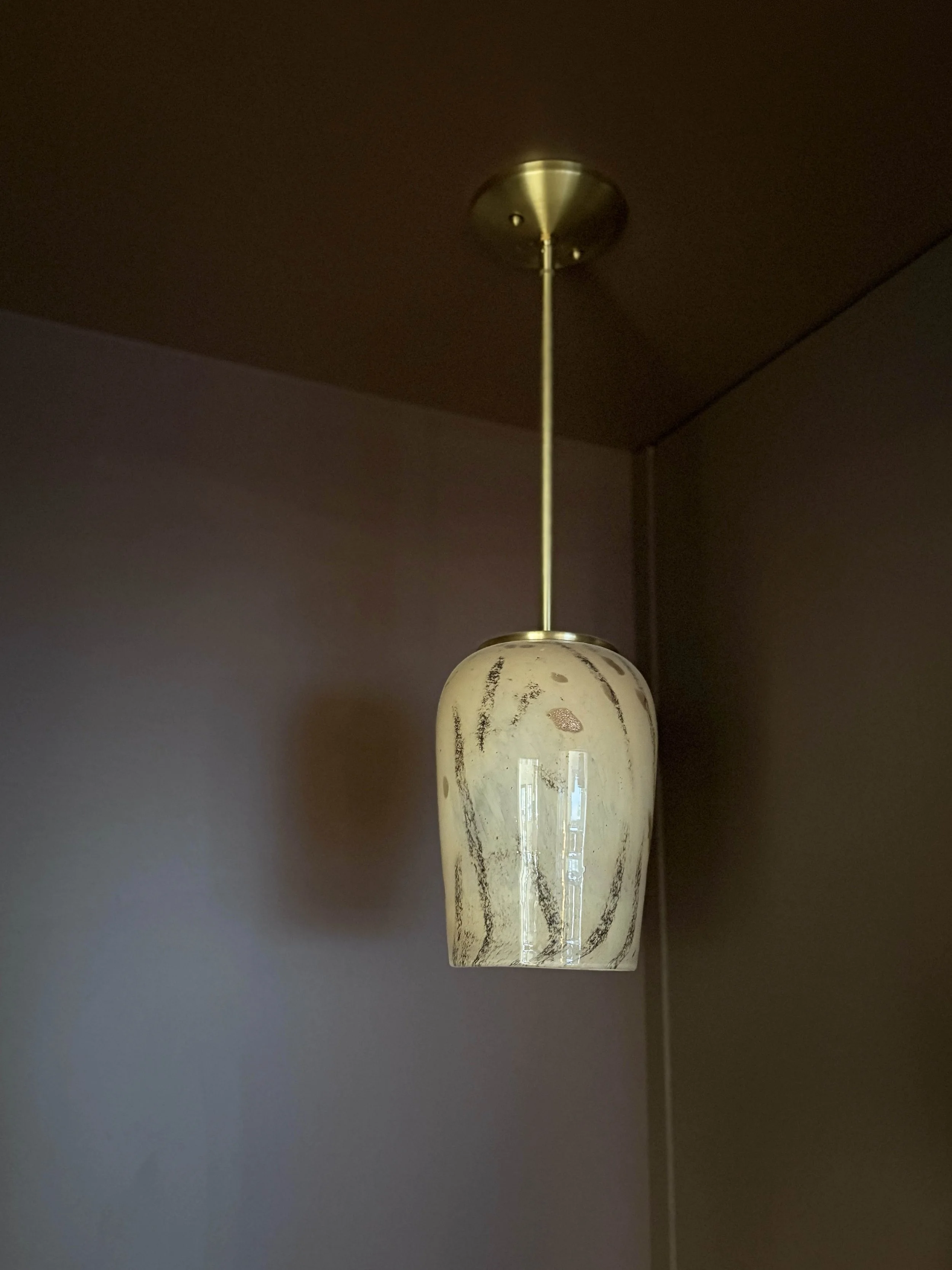
As the main view of this space from our main living area, I really wanted to create a little design moment over the laundry sink. We had can lights installed in the laundry room for the sake of practicality, but I also had them wire for a pendant above the sink. I came across this beautiful hand-blown glass pendant after choosing all the other fixtures for our renovation and I couldn’t get it out of my mind once I saw it. I’m so glad I decided to shift gears and use it here in the laundry room. It’s such a small but mighty little fixture and I love the warm glow it gives when we have it on in the evenings. I do still plan on adding some vertical shiplap panelling to this little wall behind the sink to tie in to the vertical shiplap we have on the sloped ceilings of our main living space and I think it will help make this little view even more of a visual moment.
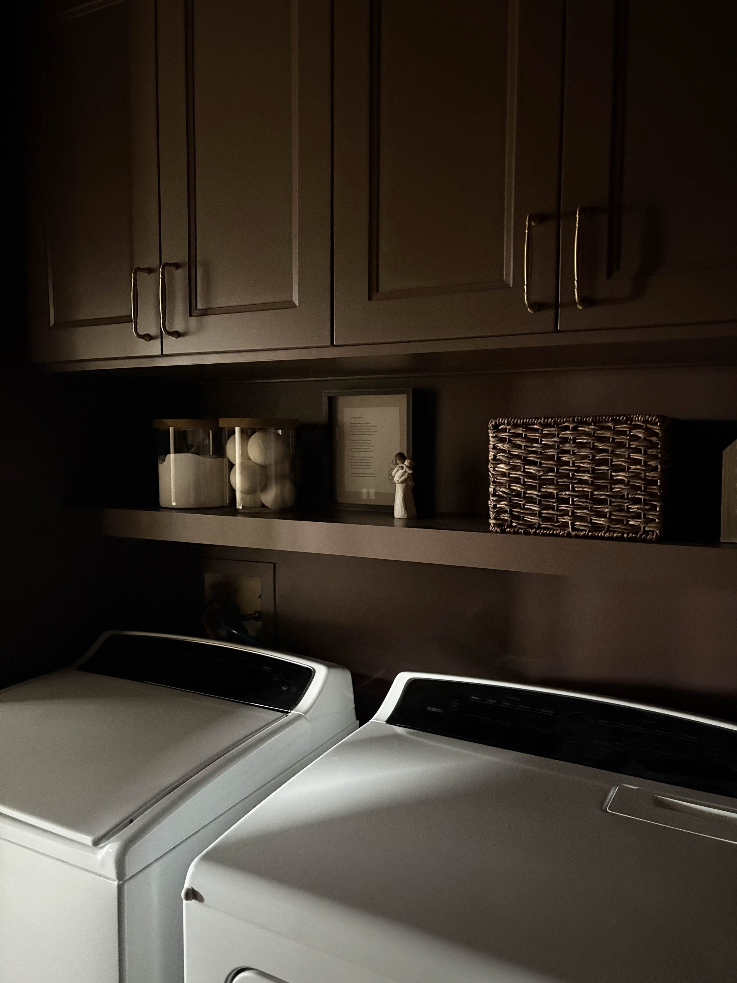
We installed upper cabinetry above the laundry machines, but it left a fairly large gap and I instantly knew that I wanted to create an open floating shelf for some styling opportunities above the washer and dryer. I built the shelf one weekend using some scrap materials (2x4s and 1/4” plywood) and painted it to blend in with the rest of the cabinetry and walls. I added some glass storage jars for some of our everyday laundry supplies and used a wicker basket to store some easy-to-grab dryer sheets. I’m excited to change up this little spot now and then to keep the room feeling fresh and seasonal.
This shot shows the moodiness of this cozy little space
The view from the garage when you walk in the space
My intention while designing this space was to strike the balance between practicality and functionality while still creating a peaceful way to enter our home. As you can see from the photos, this room is a main walkway into our house and we are bouncing in and out of here constantly as we move throughout the home. I wanted every view to feel beautiful, but also truly serve our needs. These next photos are intended to highlight some of those components, which is why I included some photos with the lights on in the space. I wanted to show you the design in natural light (which more accurately shows some of the finishes), but also wanted to demonstrate how it functions in our normal day to day life.
A peek into the kitchen
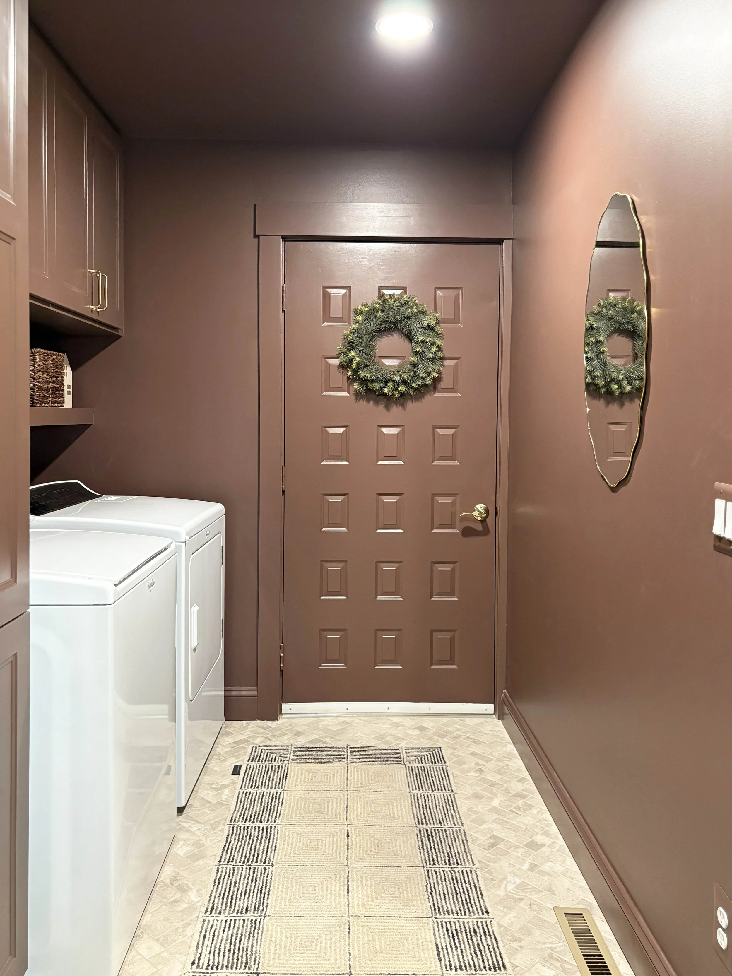
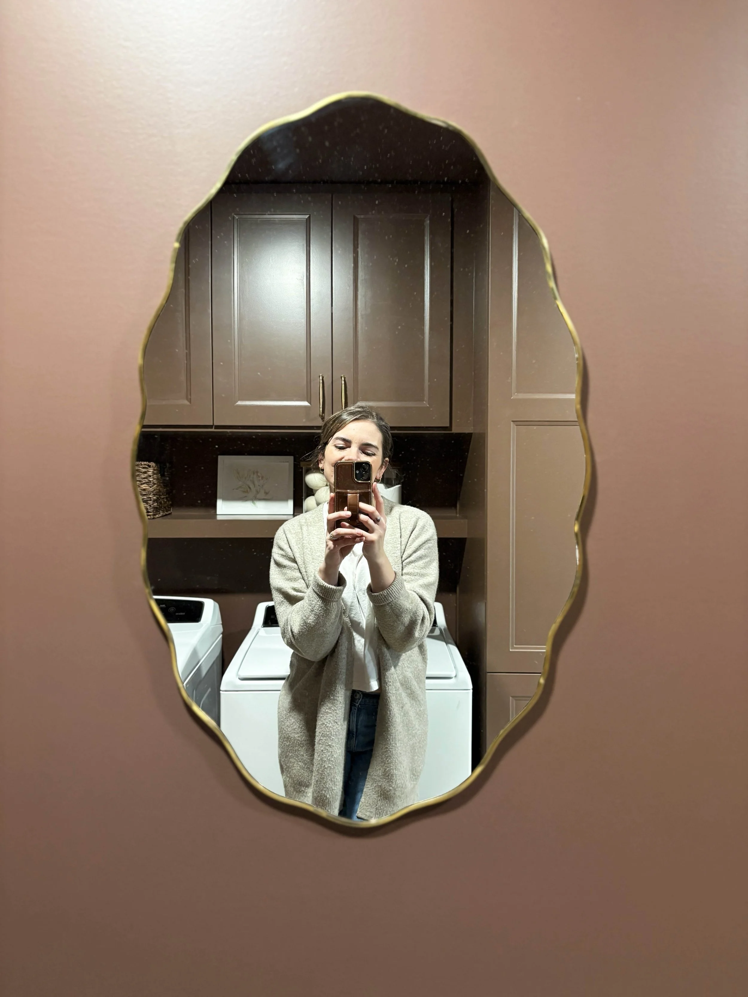
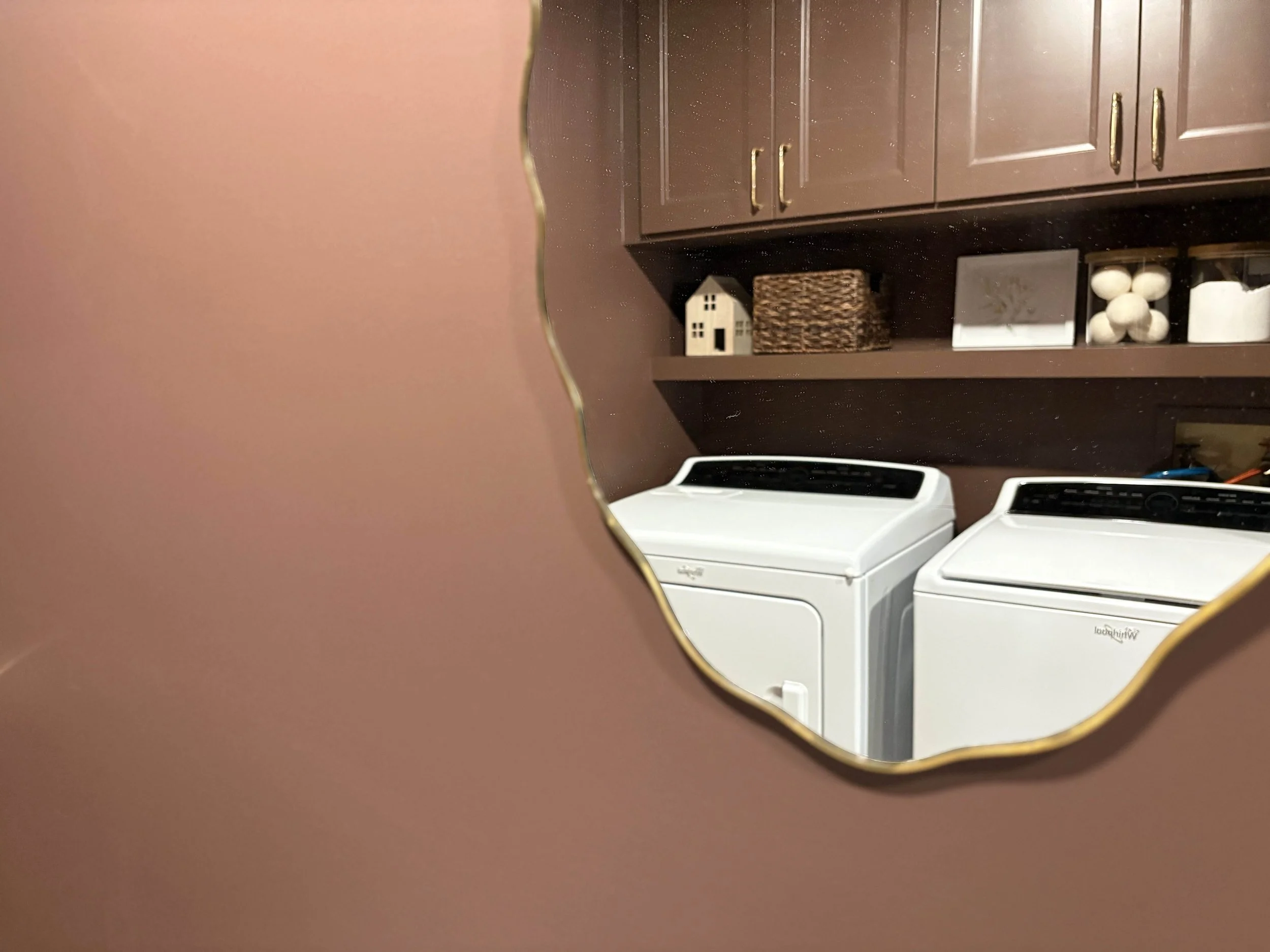
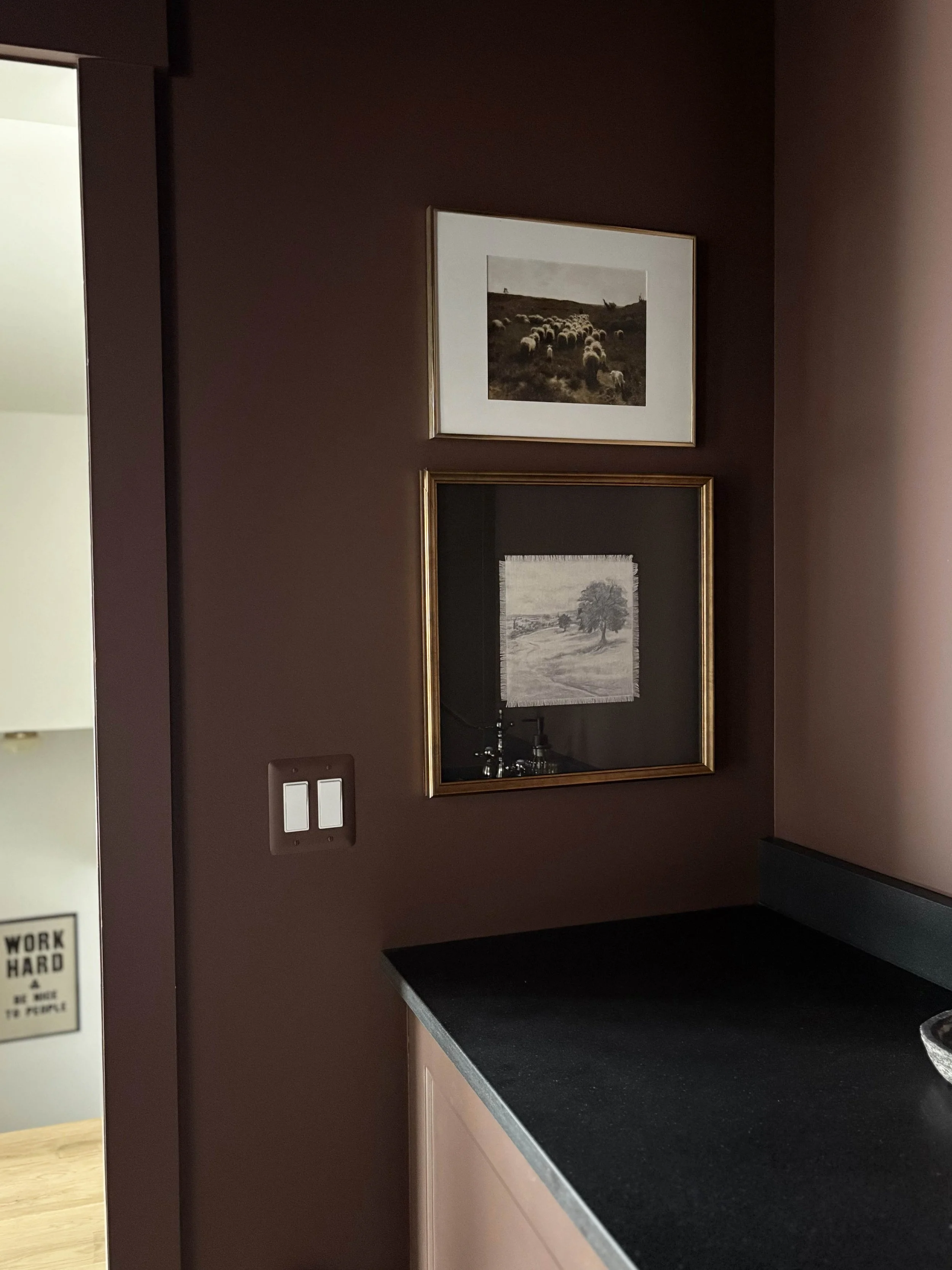
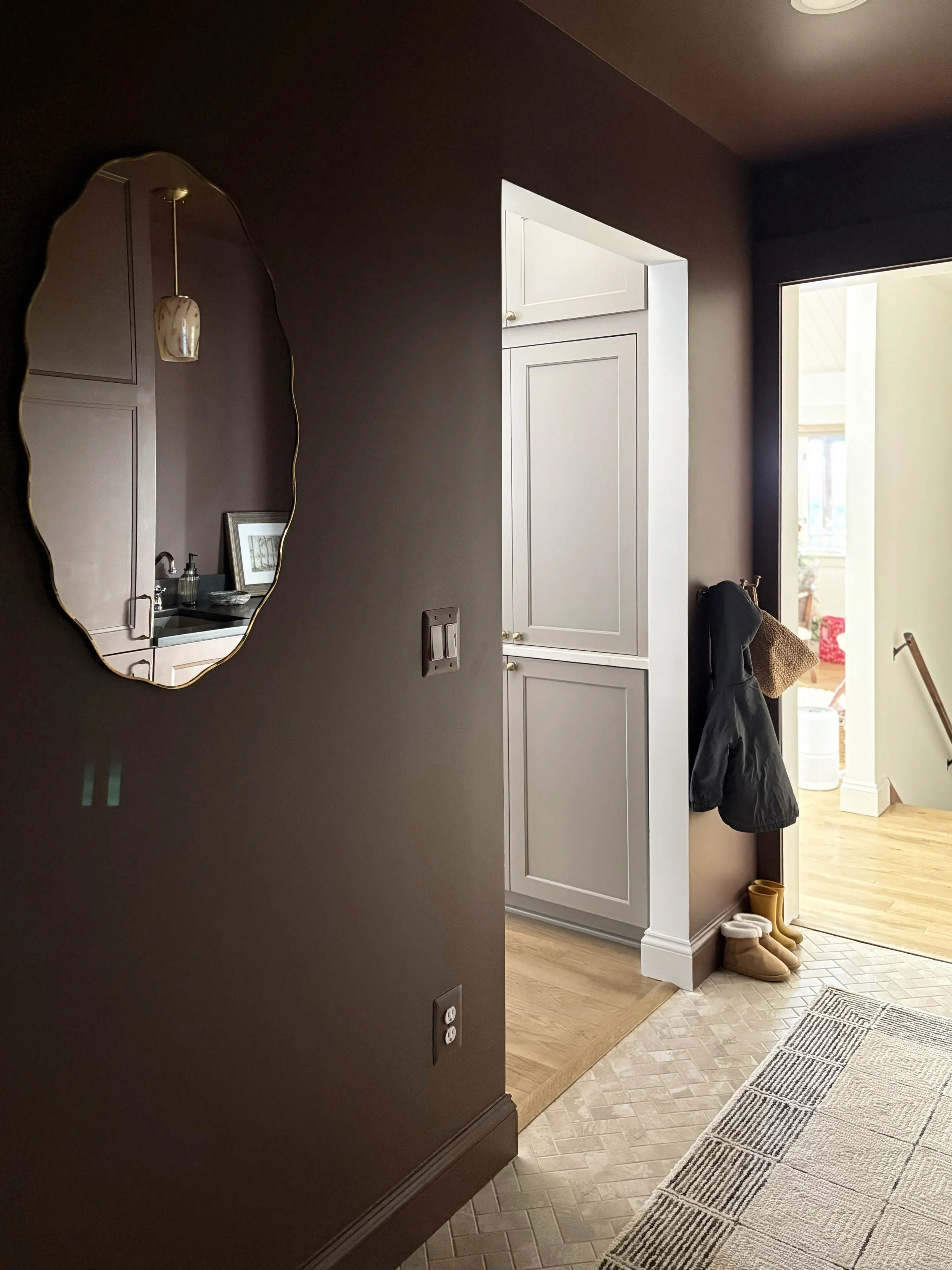
This room definitely needed a mirror and this big blank wall offered a perfect canvas, but with one caveat: there is hardly any depth on this wall due to it being a main walkway into the house. I needed to find a mirror that was very slim and wouldn’t risk being bumped. I ended up sourcing this beautiful wavy oval mirror from Magnolia that is ultra-thin. It was very easy to install and offers such a beautiful softness to the room.
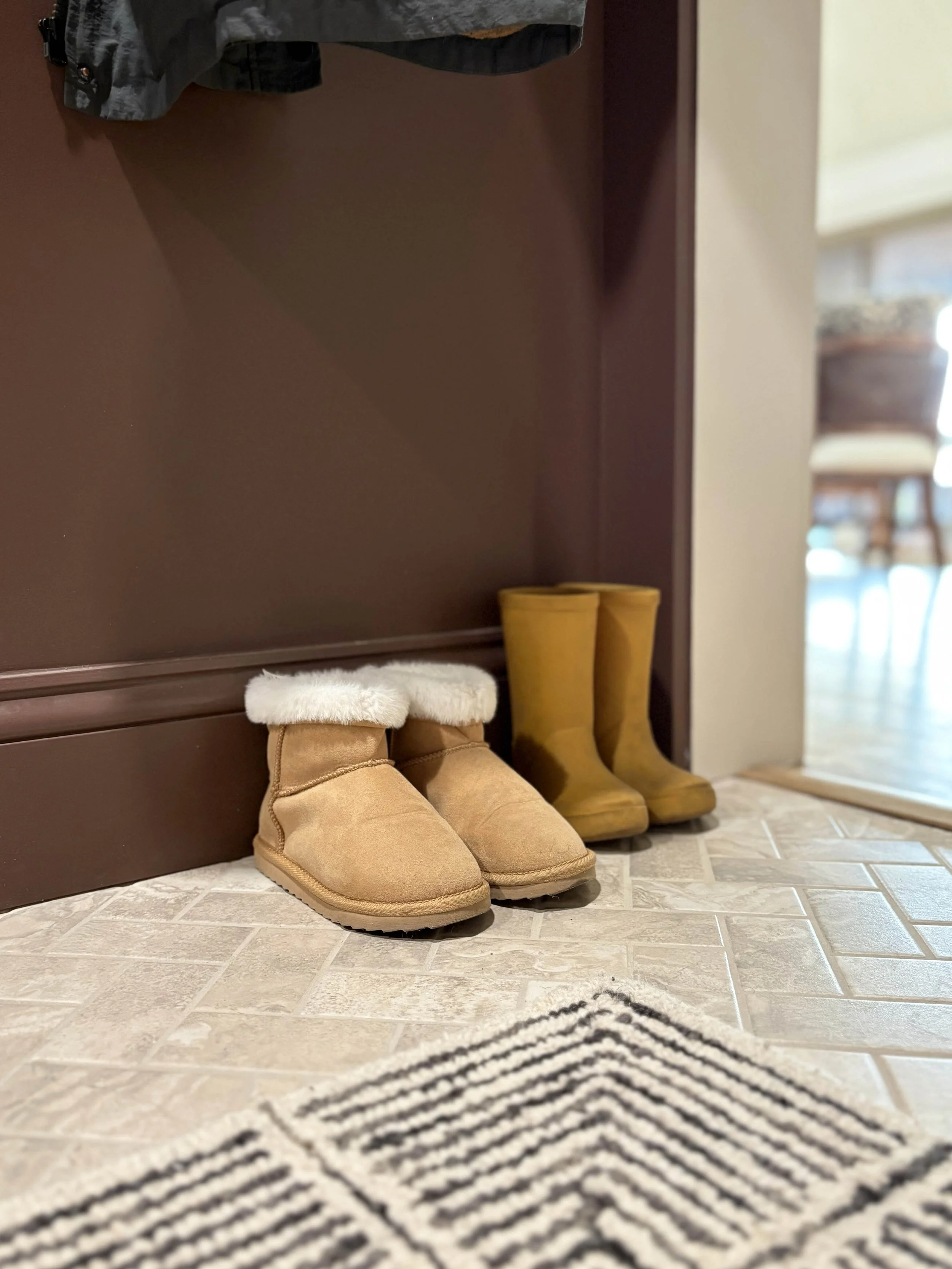
We have two young daughters and it’s always a priority for me to set them up for success in having some independence in their routines. While I did create some hanging and shoe storage in one of the cabinets, I also mounted this small rack of hooks down low so they could hang up their coats independently. This small little wall was the perfect place to do that and since it’s only three hooks, we haven’t had any issues with it getting out of control.
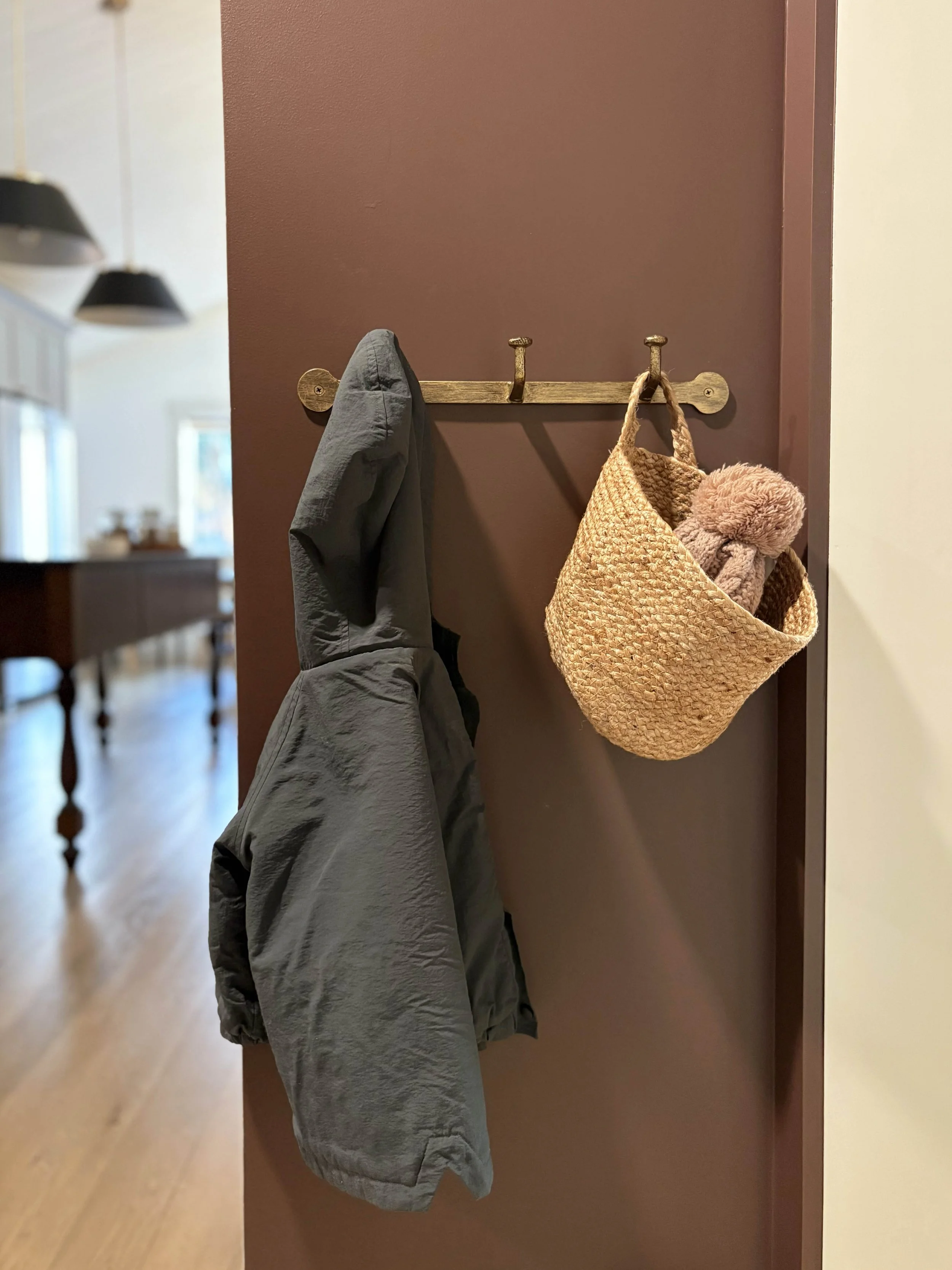
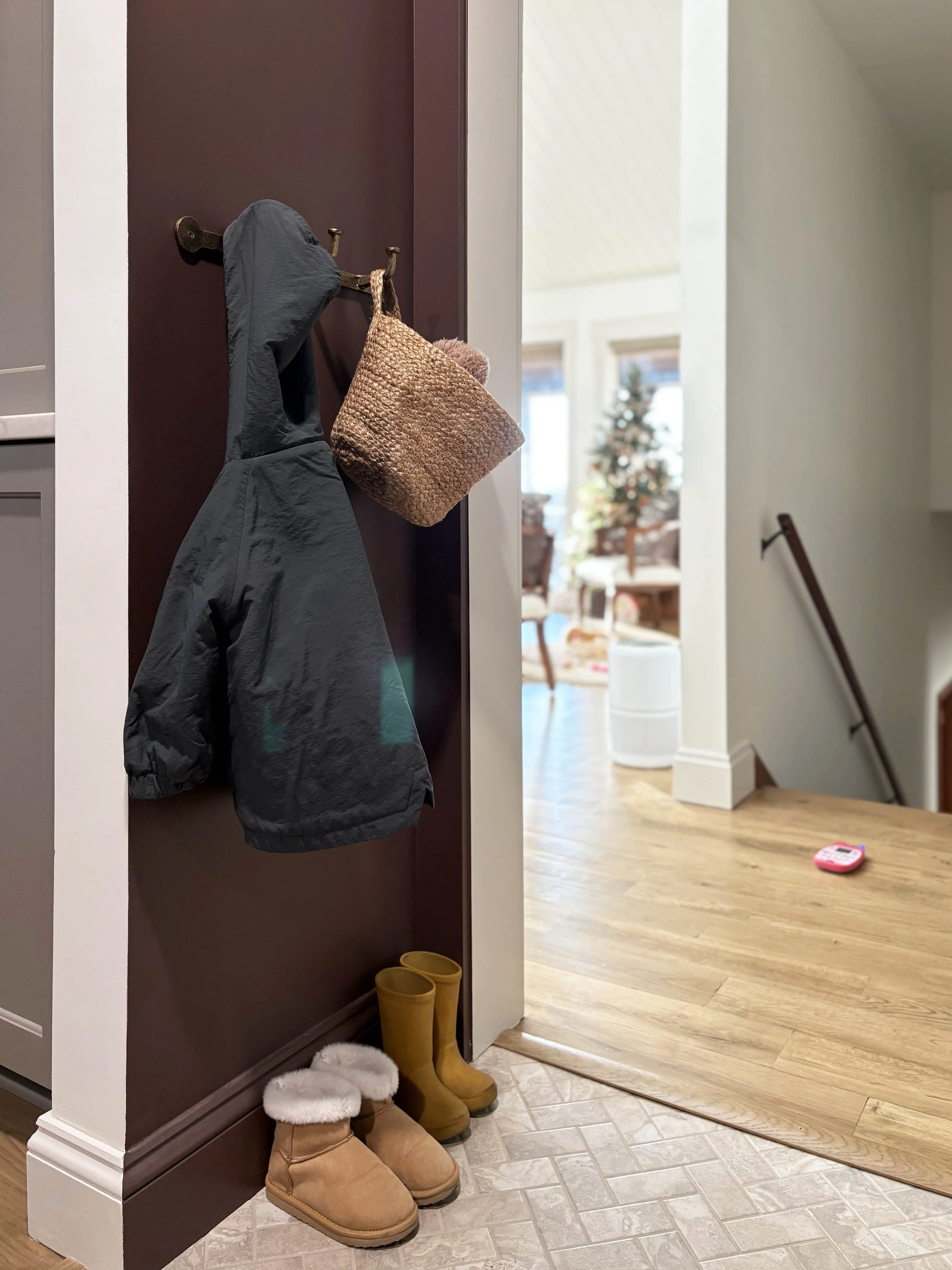
Easy storage for our most-worn outerwear
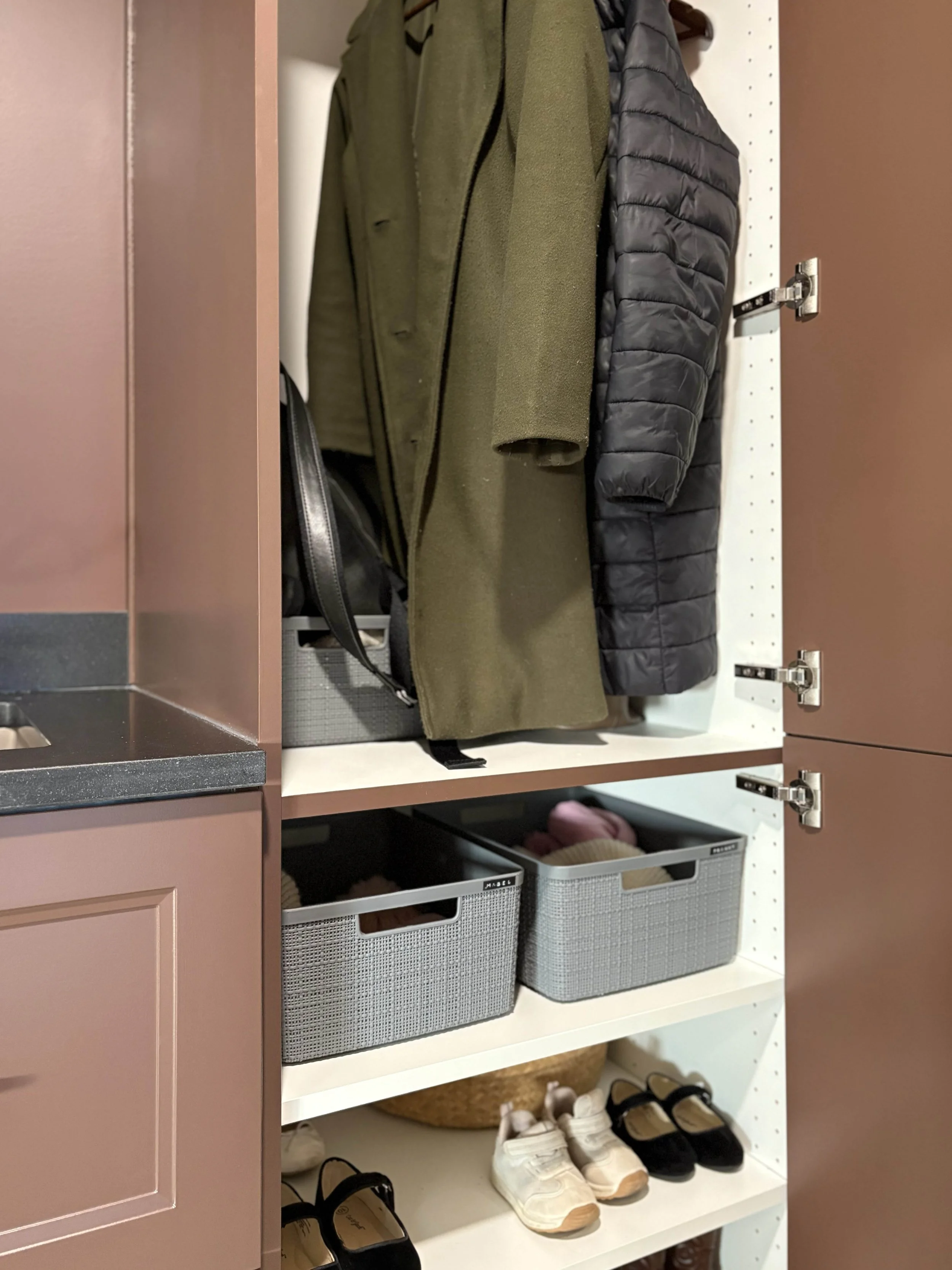
Each of our kids has a labelled basket
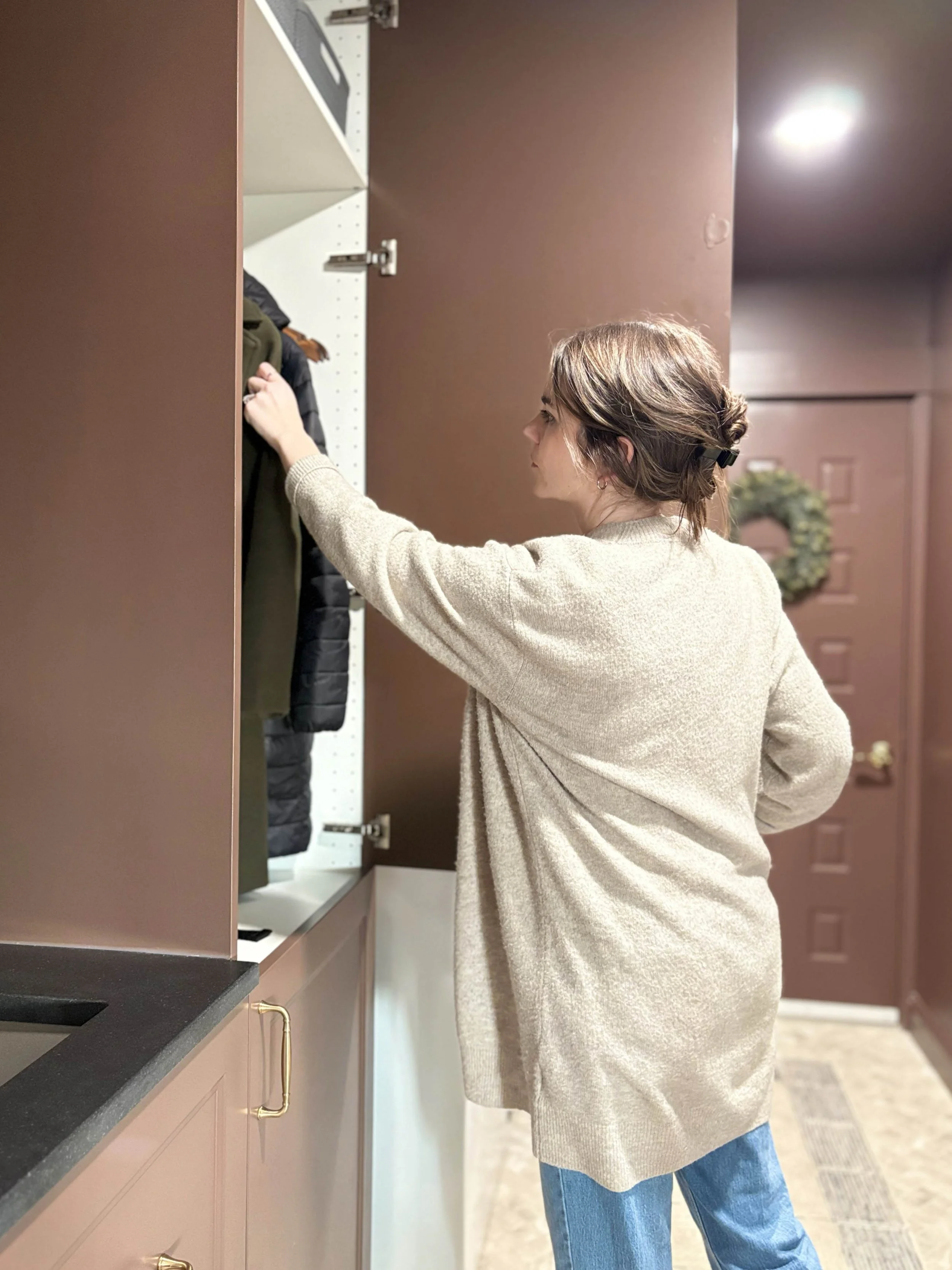
In the full-height cabinet, I left out the adjustable shelves (although I have them in the garage if we ever need them) and installed a wooden hanging bar right into some of the pre-drilled holes within the cabinet. We can very easily remove this if we ever change our mind and turn this cabinet into shelf storage instead. The interior is not huge, but we are able to store the kids’ snow pants and 4-5 adult coats comfortably. We prioritize only keeping our everyday coats and shoes here and have our other coats stored in the front entryway closet. I purchased a handful of matching plastic storage baskets and we each have one to store our personal mittens, scarves, hats, and earmuffs. This system has particularly worked well for our girls! On the bottom portion of the cabinet, I installed the adjustable shelves and we keep some of our most worn pairs of shoes in there for easy access.
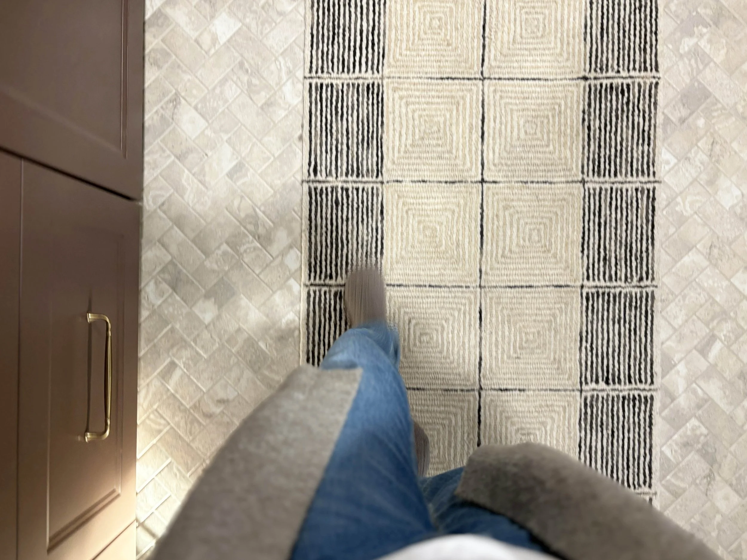
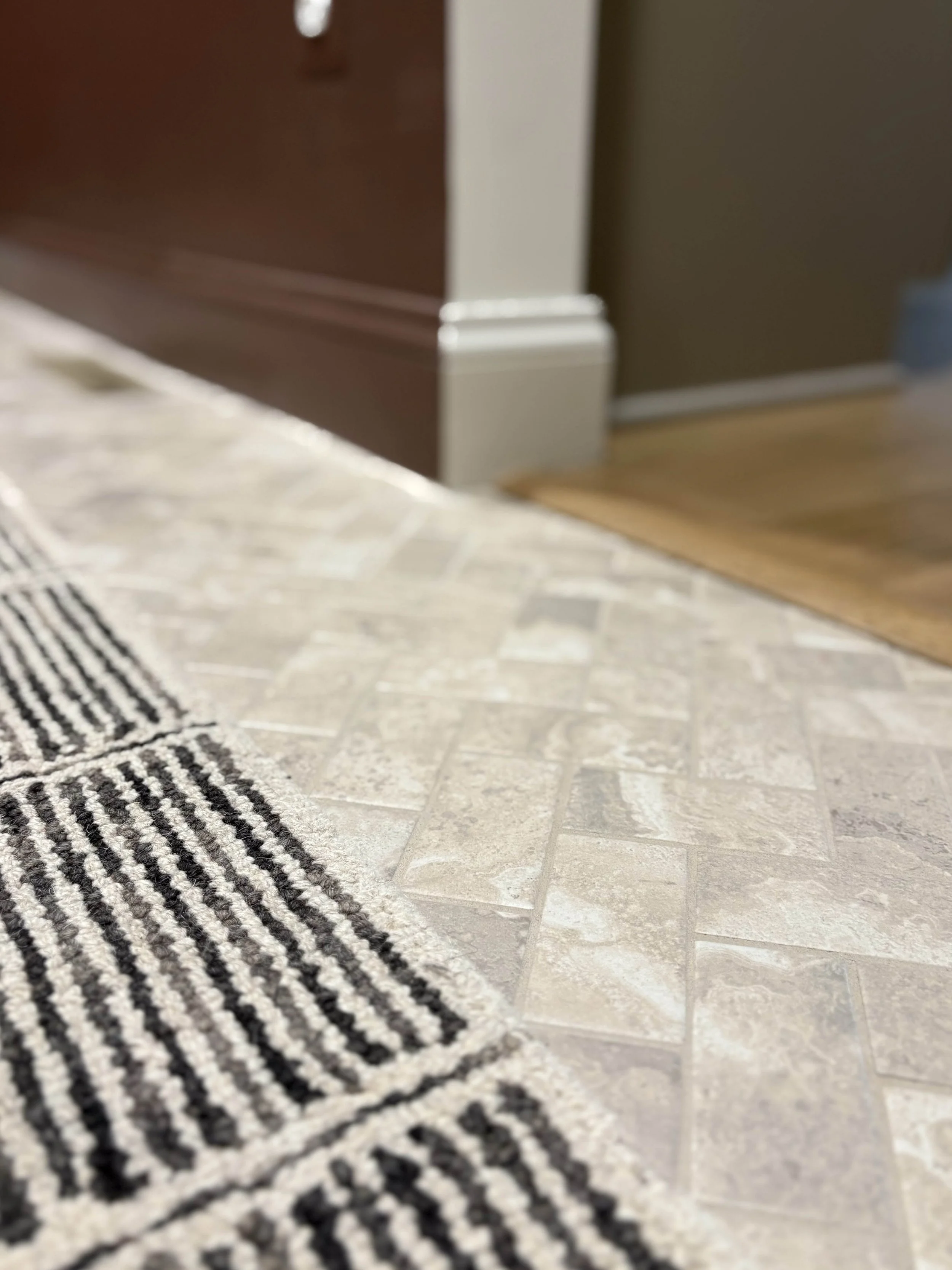
The final design element to talk about are the floors. I really wanted to use tile for practical reasons, but I originally envisioned a large scale tile. Once construction began, we learned how wonky our floors are and long story short, a large format tile would have immediately cracked with use. We had to pivot and I kept sourcing tiles I loved, only to be told it was still too large. Eventually it was made clear that we had to use a tile available on a sheet and my heart sank. I really didn’t want a mosaic look. With a lot of research and perusing, these small-format herringbone mosaic tiles were the only ones I could find that I even somewhat liked. I ordered a sample and once I saw them in person, I knew they would be perfect. We had them installed using an ivory grout and I really love the texture the small format size brings to this room. It ended up being a perfect choice. I also laid a neutral runner down the length of the room and the combination of the textured tile with the graphic rug feels so interesting without drawing too much attention.
The Moodboard (and Resources)
This small space was such a fun area to design! I felt free to push boundaries and go bold because it was such a small and contained area. I really enjoyed working through the moodboard and finding and collecting pieces that felt interesting and intentional. Below you can view the final moodboard and I have included links to all the resources and products we used (when available) at the end of this post.
Thanks for joining me on this little photo tour! I’ll be sharing more spaces soon.

Laundry Room Source Guide
Paint: Wall (Eggshell), Trim (Semi-Gloss), Ceiling (Eggshell), Cabinetry (Satin) are all the same color, Benjamin Moore
Floors: Herringbone Tile Tiles Direct // Grout Lowes
Cabinetry: Sektion cabinet line with Axstad door line, IKEA // Primer, Lowes // Pulls, MOD Accents // Sink, Lowes // Faucet, Lowes // Wooden Hanging Brackets, Lowes // Wooden Hanging Rod, Lowes // Plastic Storage Baskets, Walmart
Decor: Runner Rug, Wayfair // Pendant, Shades Of Light // Pura, Pura // Mirror, Magnolia // Brass Hooks, Magnolia // Glass Storage Jars, Target // Dryer Balls, Target // Wicker Basket, Target // Sheep Print, Etsy // Tree Print, Target (old)